In California, We Trust
The challenge
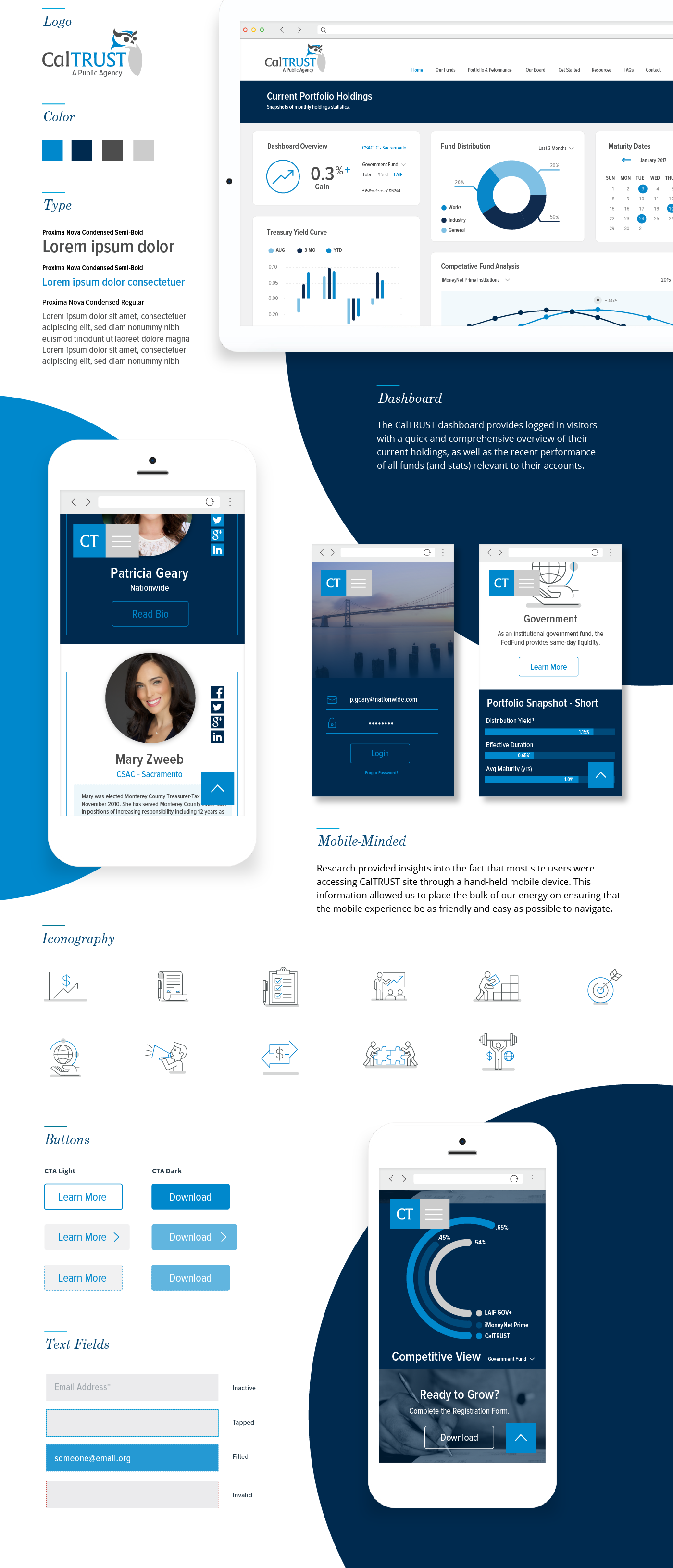
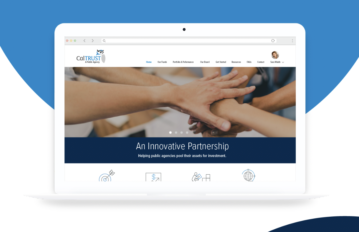
CalTRUST’s digital presence no longer reflected the clarity, credibility, or responsibility required of a public investment agency. The experience was visually dated, difficult to navigate, and under-optimized for mobile—making it harder for users to quickly understand performance, access key information, or feel confident in the platform.
The insight
Trust is built through clarity, not complexity. Research showed that users—many accessing the platform via mobile—needed fast, intuitive access to high-level performance insights without sacrificing transparency or depth. A calmer, more human experience could strengthen credibility while making complex financial information easier to understand.
The solution
We led a ground-up rebrand and website redesign that unified CalTRUST’s mission, visual identity, and user experience into a cohesive, mobile-first system. A refined visual language—clean typography, restrained color, and purposeful iconography—reinforced institutional trust while improving approachability. The experience was structured around clear user paths, separating public storytelling from authenticated dashboards, where performance data and portfolio insights are presented through intuitive, scannable visualizations designed for quick comprehension across devices.