Intel Capital — News & Brand Experience Concepts
The challenge
Intel Capital needed a news and storytelling platform that could do more than aggregate announcements. The existing experience leaned heavily on corporate conventions—dense, inward-looking, and visually indistinct from the parent brand—making it difficult to convey Intel Capital’s role as a forward-thinking, globally connected investment organization. The challenge was to elevate clarity, credibility, and relevance while giving Intel Capital its own voice within the broader Intel ecosystem.
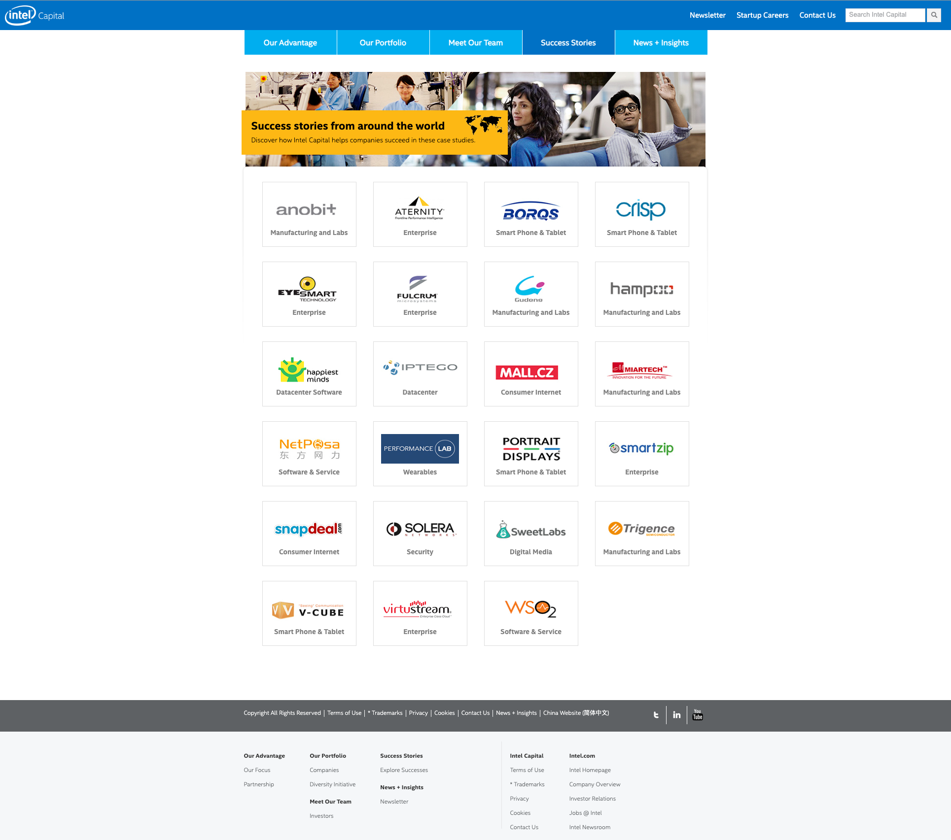
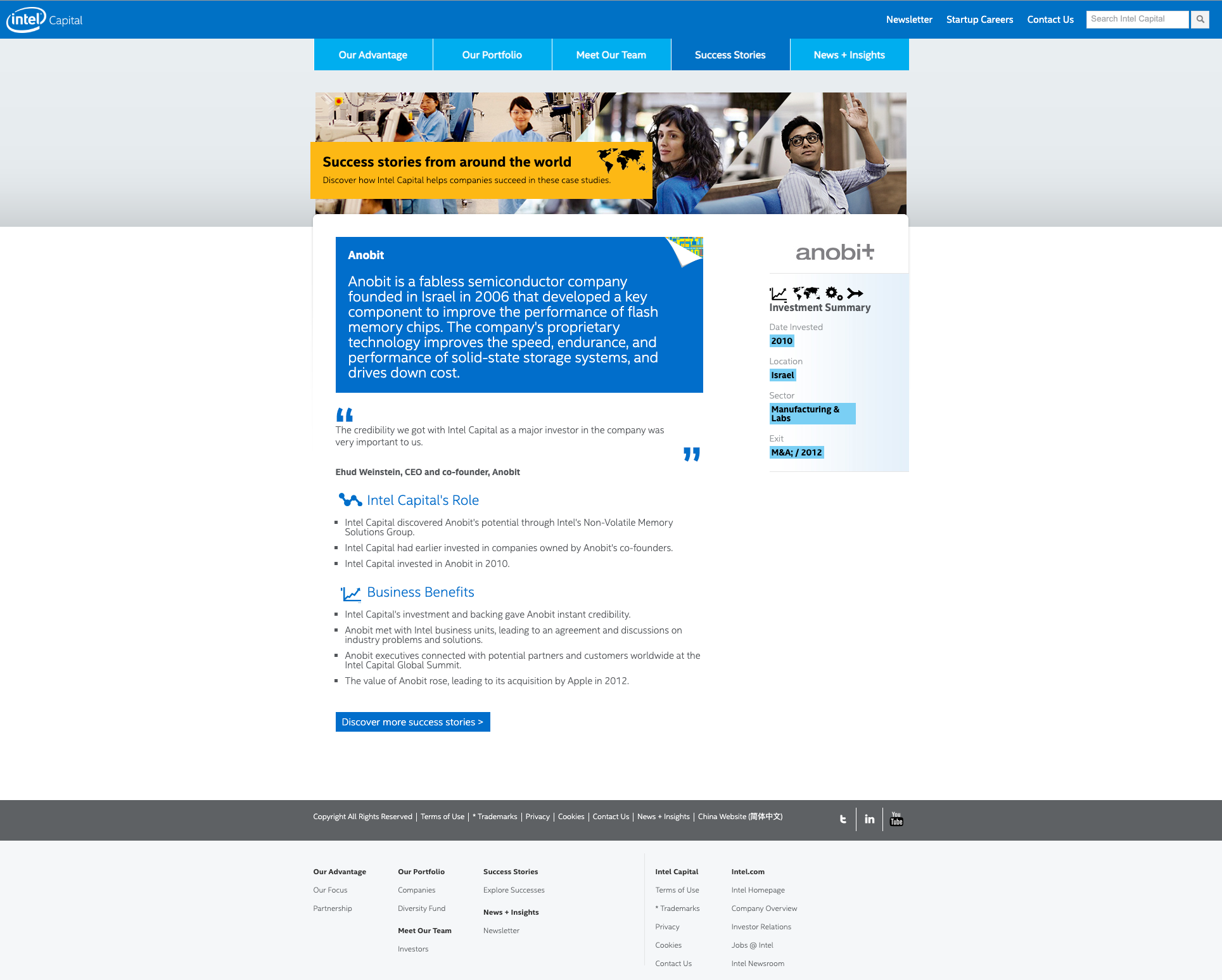
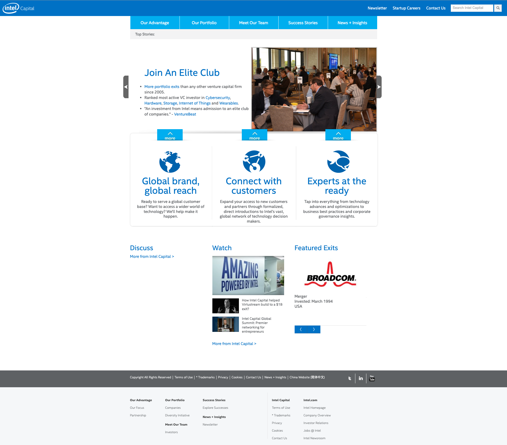
The Intel Capital website and brand BEFORE our winning proposal:
Click image to enlarge
The insight
Intel Capital operates at the intersection of technology, people, and possibility—but its story isn’t purely technical. It’s human, global, and dynamic. To communicate that effectively, the experience needed to balance institutional trust with editorial energy, and data-driven rigor with human narrative. We recognized that credibility could be preserved without defaulting to corporate sameness—and that visual distinction, when applied with intention, could strengthen authority rather than dilute it.
The solution
We proposed two distinct but complementary design directions—both grounded in modular, responsive UX systems and both designed to scale across web, social, and physical touchpoints—each offering a different interpretation of how Intel Capital could show up in the world.
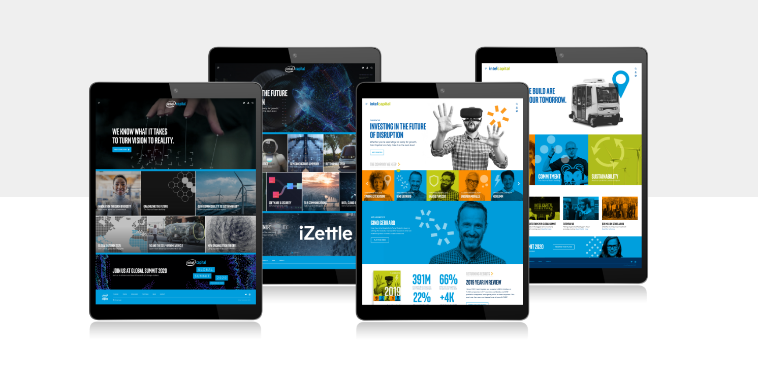
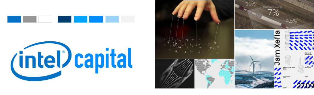
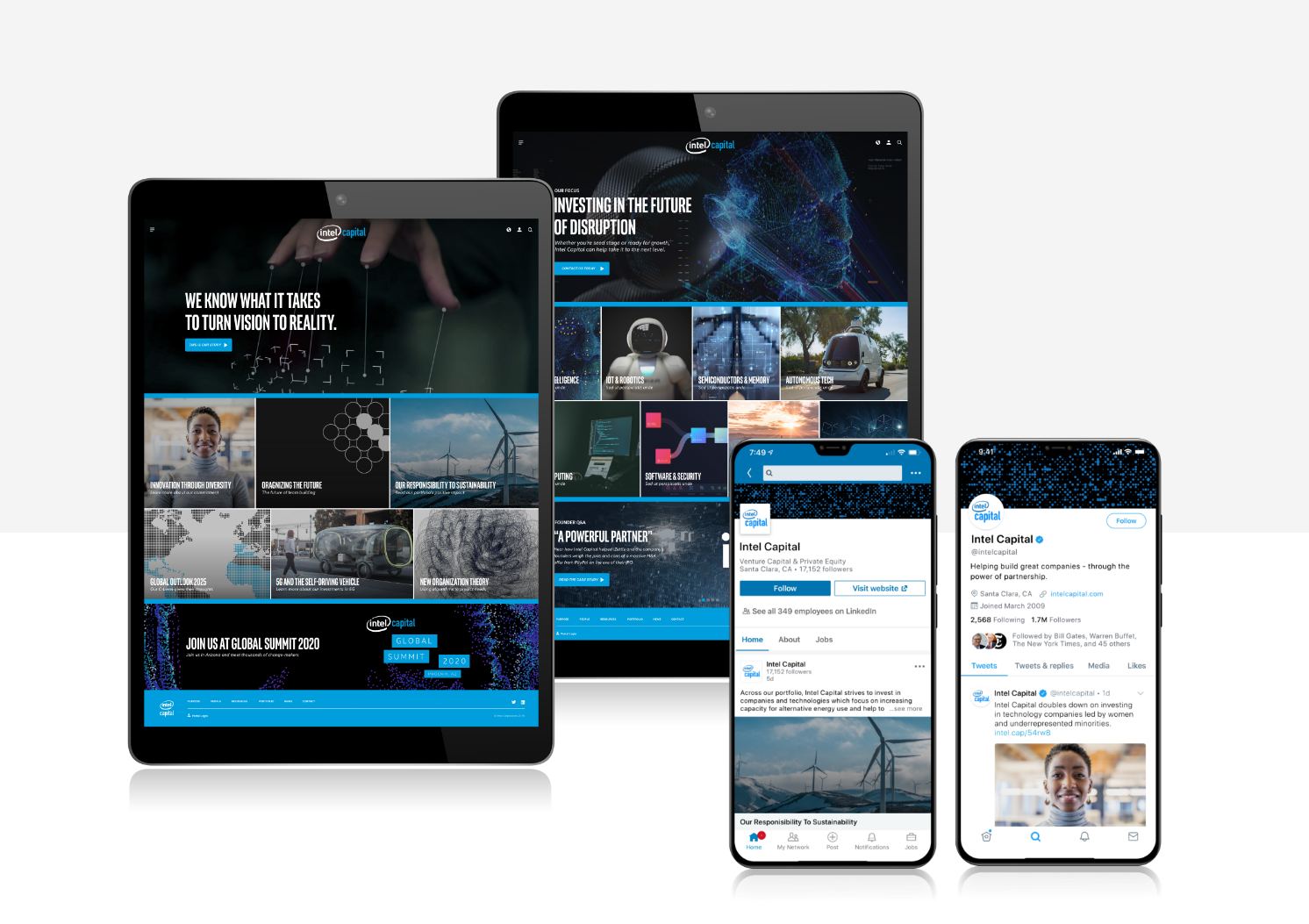
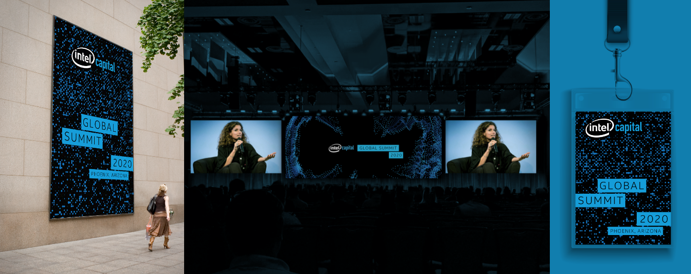
Deep Dive: Concept A–Subtle Evolution
A refined extension of the Intel brand, reimagined through a more editorial and human lens.
This approach stays closely aligned with Intel’s established visual language while introducing greater warmth, depth, and narrative flexibility. Darker tonal palettes, immersive imagery, and modular content grids create a sense of seriousness and focus, while curated storytelling surfaces highlight founders, ideas, and innovation in context.
From a UX standpoint, the experience emphasizes clarity and scannability—prioritizing featured stories, thematic collections, and clear pathways into deeper content. The result is a confident, modern news platform that feels unmistakably Intel, yet more expressive and engaging than what came before.
Best for: Maintaining strong brand continuity while modernizing tone, storytelling, and usability.
Click image to enlarge
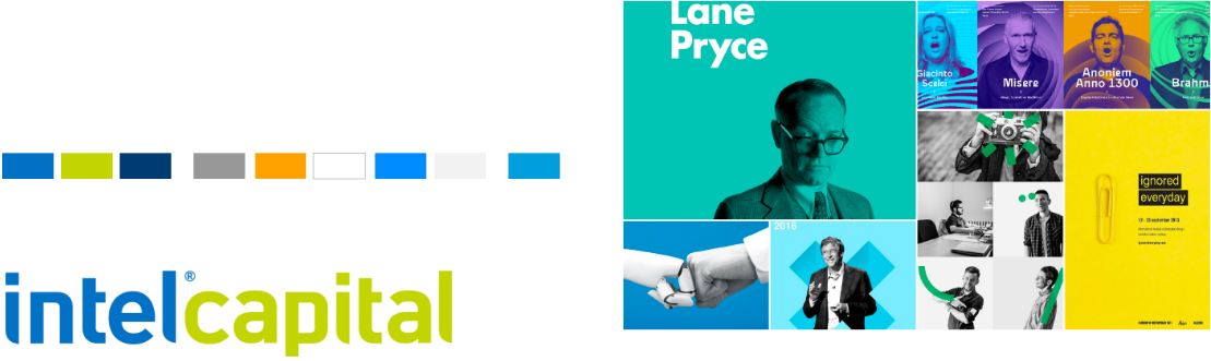
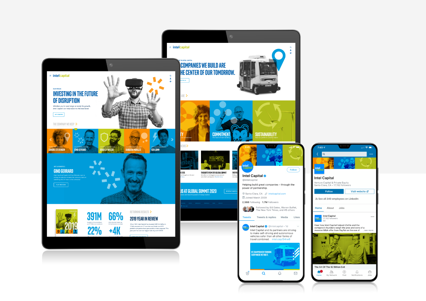
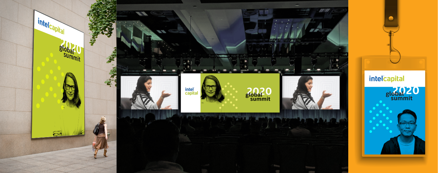
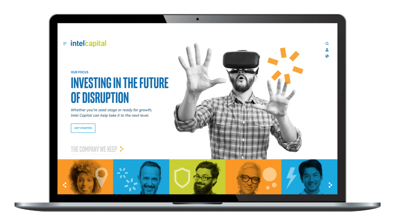
Deep Dive: Concept B–Colorful, measured departure
A bolder departure that positions Intel Capital as a distinct, contemporary voice within the venture landscape.
This direction pushes further away from the parent brand, using vibrant color systems, graphic blocks, and human-centered photography to create a more energetic, magazine-like experience. Content is organized into clear editorial themes—investing, people, ecosystems, impact—making the platform feel current, alive, and outward-facing.
UX design here leans into momentum: strong hierarchy, modular cards, and flexible layouts that adapt seamlessly across devices and channels. The system is designed to extend naturally into social feeds, event environments, and large-scale physical installations—creating a cohesive brand presence wherever Intel Capital shows up.
Best for: Establishing a clear point of view, attracting new audiences, and signaling leadership beyond traditional corporate norms.