
Healthcare made helpful
The challenge
The client, a local therapist, had an existing site and brand that relied heavily on long-form copy, minimal visual hierarchy, and an overabundance of individual pages with confusing taxonomy. As a result, visitors—often arriving in vulnerable moments—struggled to quickly understand who she is, what she stands for, and how to move forward. This challenge was compounded by the client’s understandable reluctance to significantly change an experience and visual identity she had already invested in.
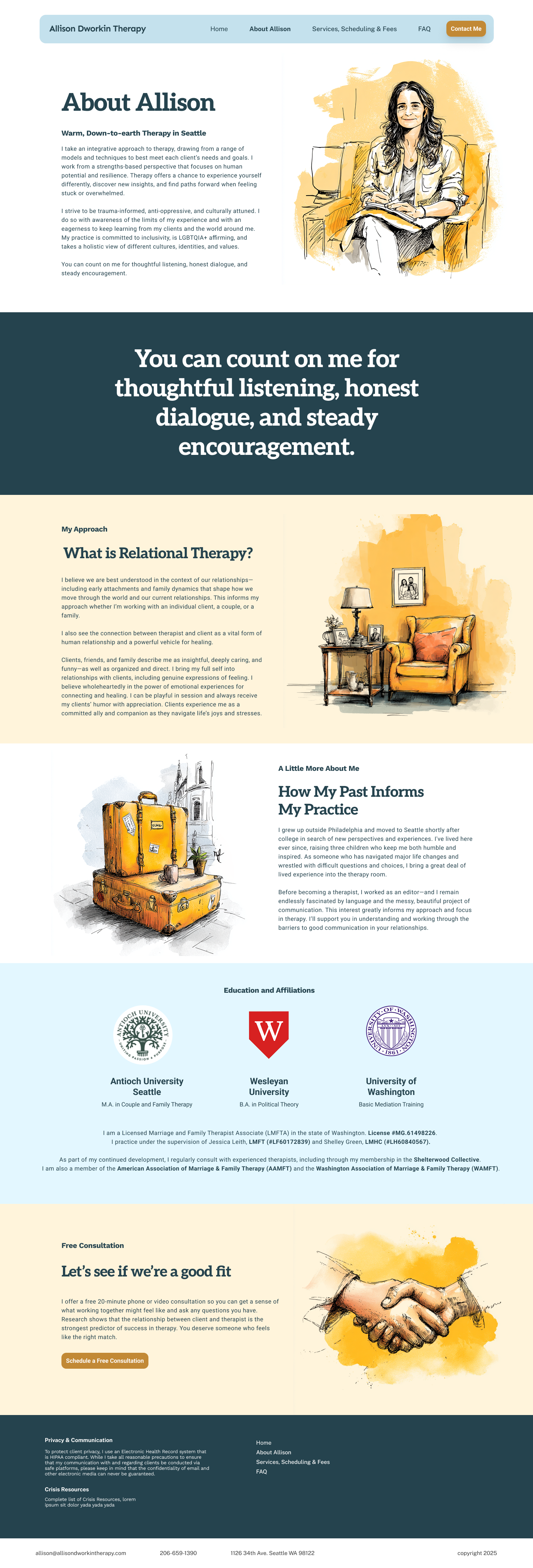
Existing client site/brand BEFORE our redesign
The insight
In healthcare, UX is part of the care itself. A site must quickly build trust, communicate values, and answer essential questions—availability, location, insurance, and next steps—before users move on. Clear structure, thoughtful pacing, and a supportive brand presence help meet both emotional and practical needs without adding friction.
The solution
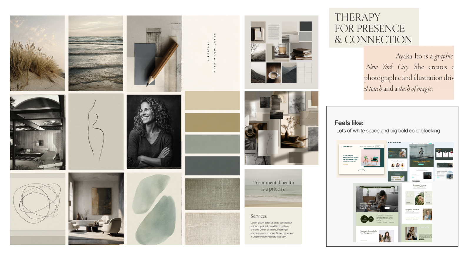
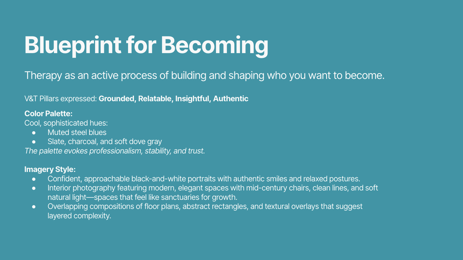
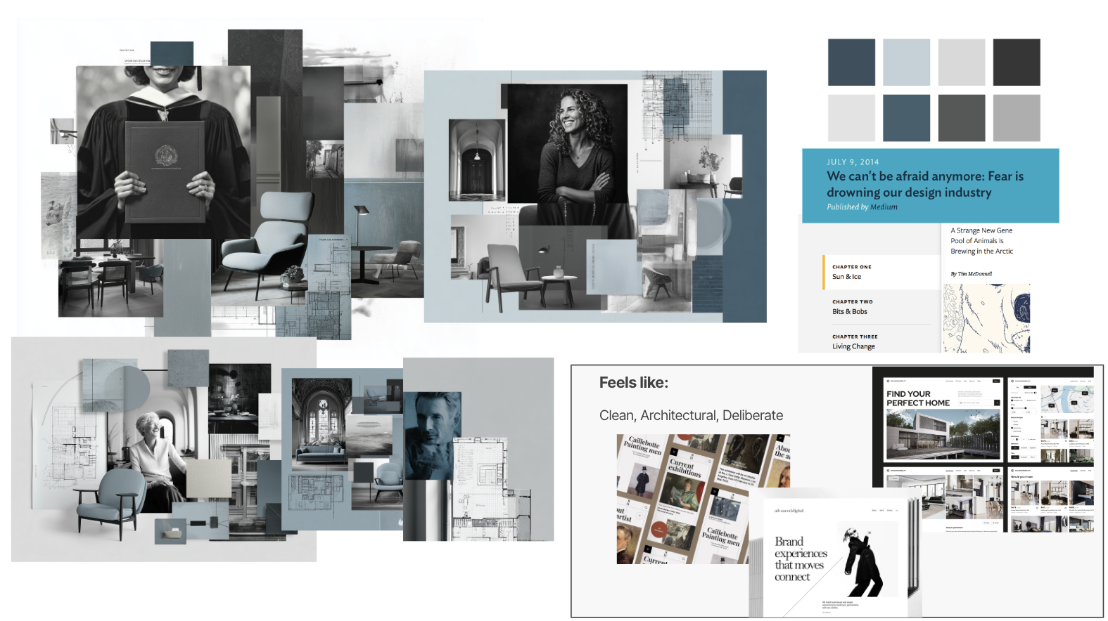
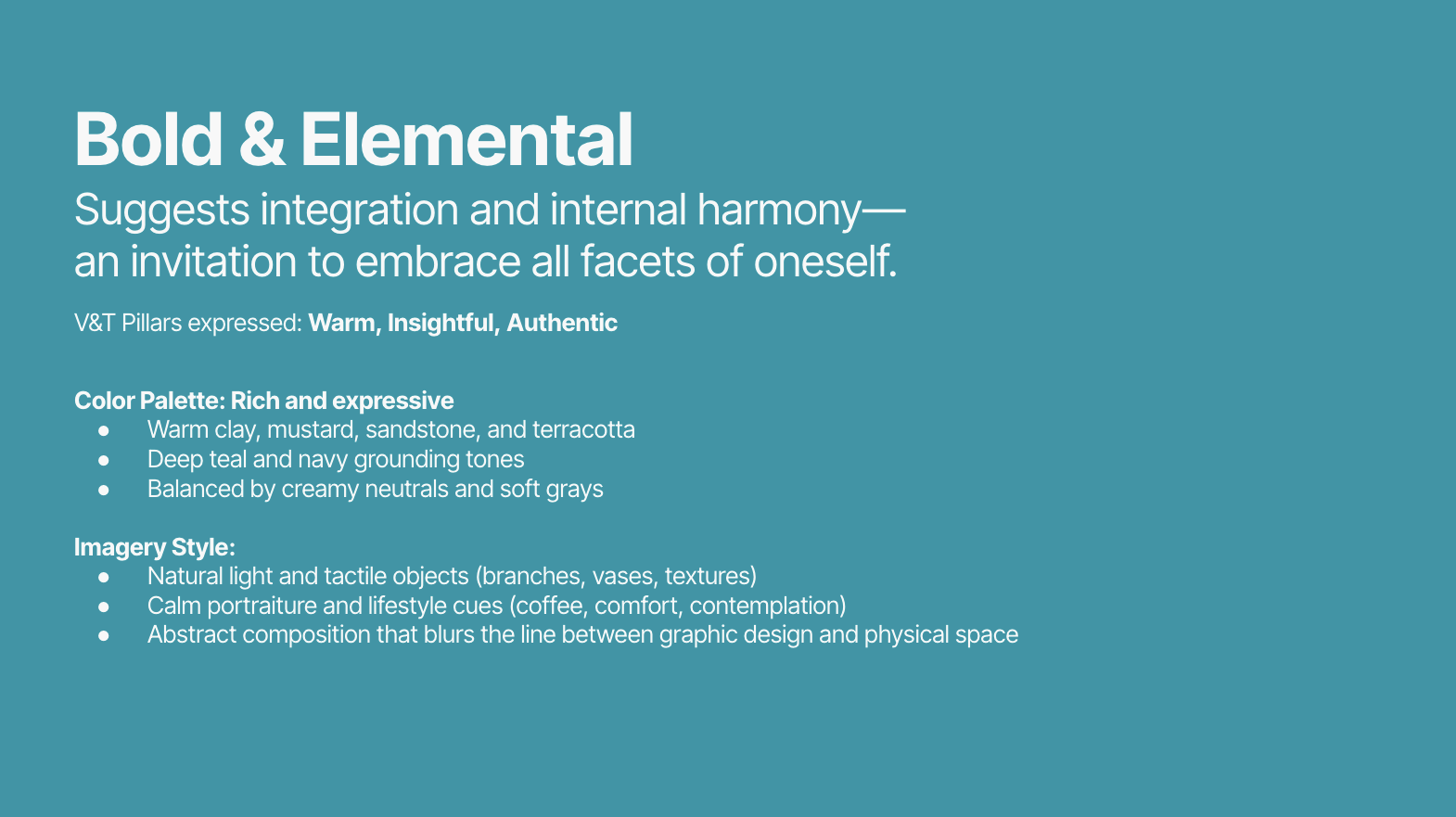
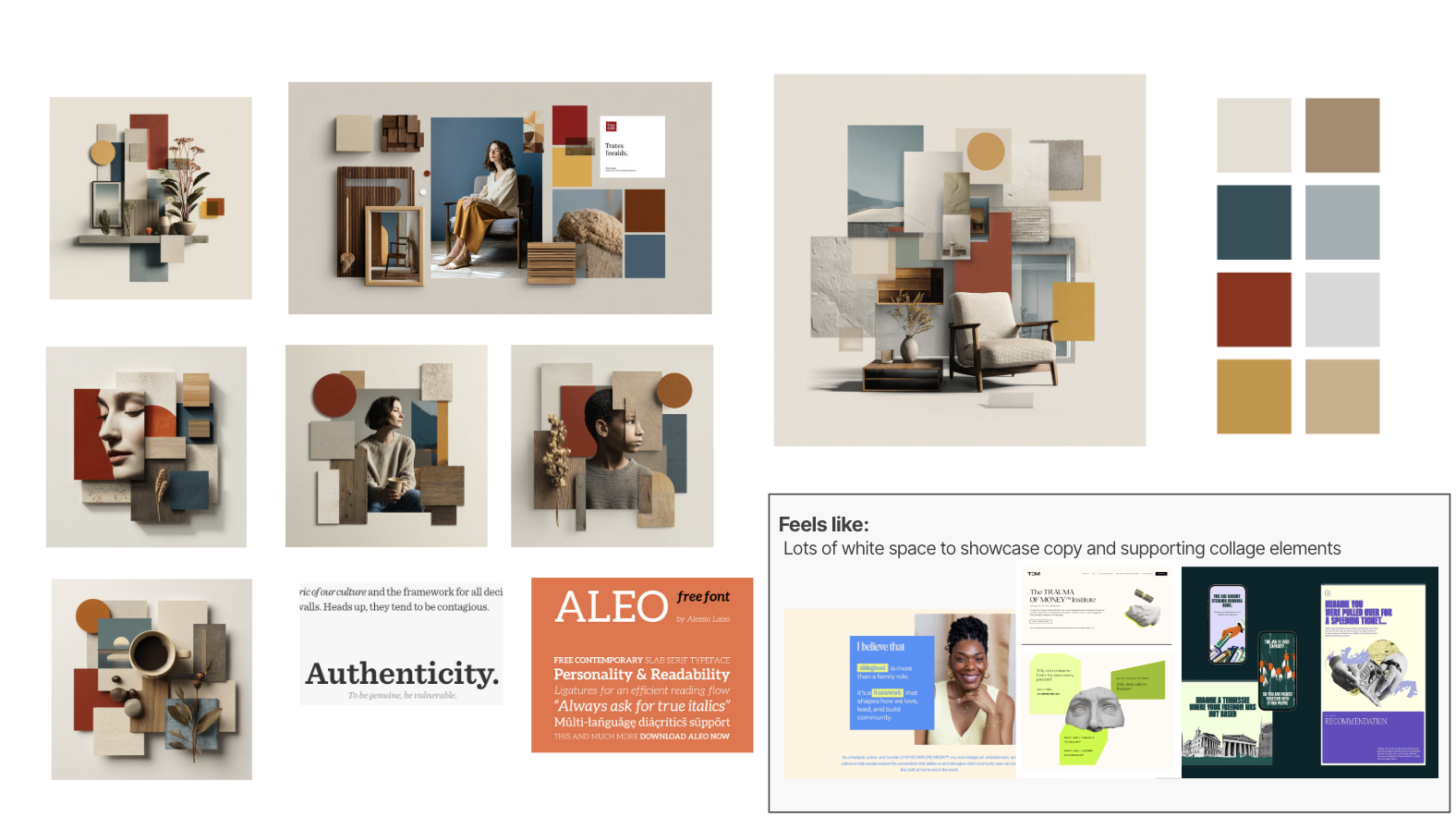
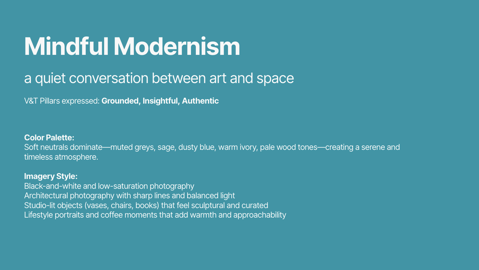
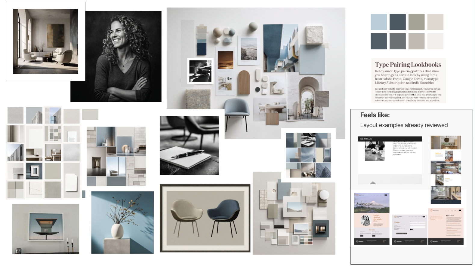
We began by exploring what the brand felt like at a conceptual level, developing four distinct creative directions that reimagined how the practice could show up—each offering a different emotional and visual point of view, grounded in the client’s stated preferences and insights.

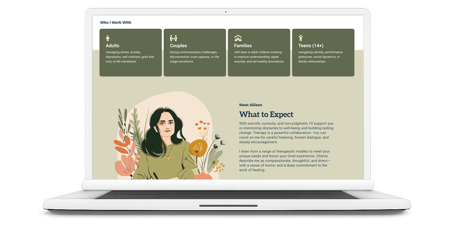
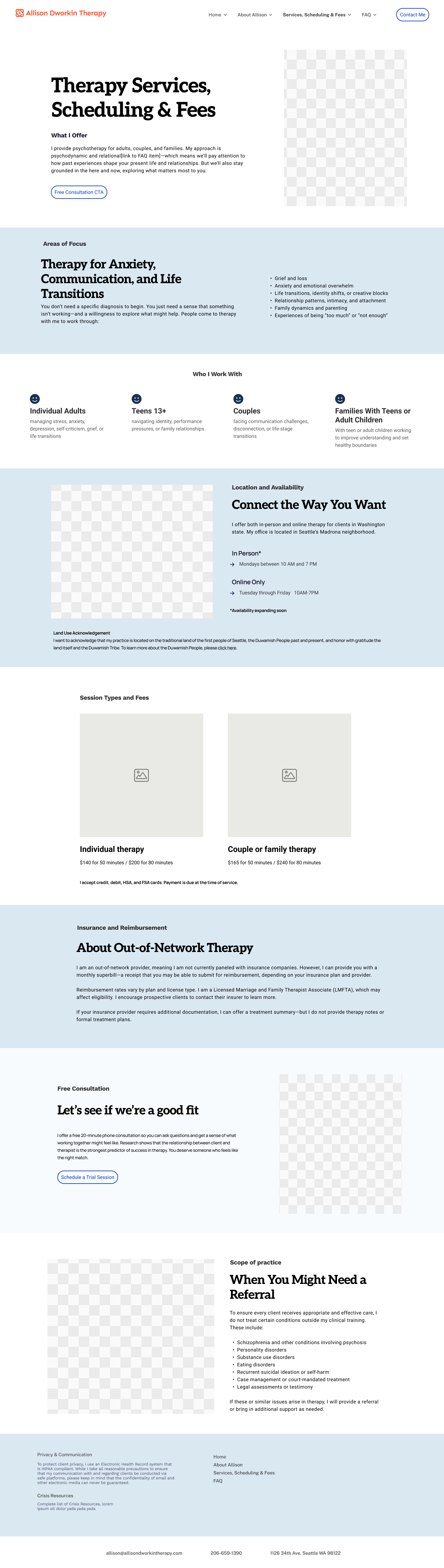
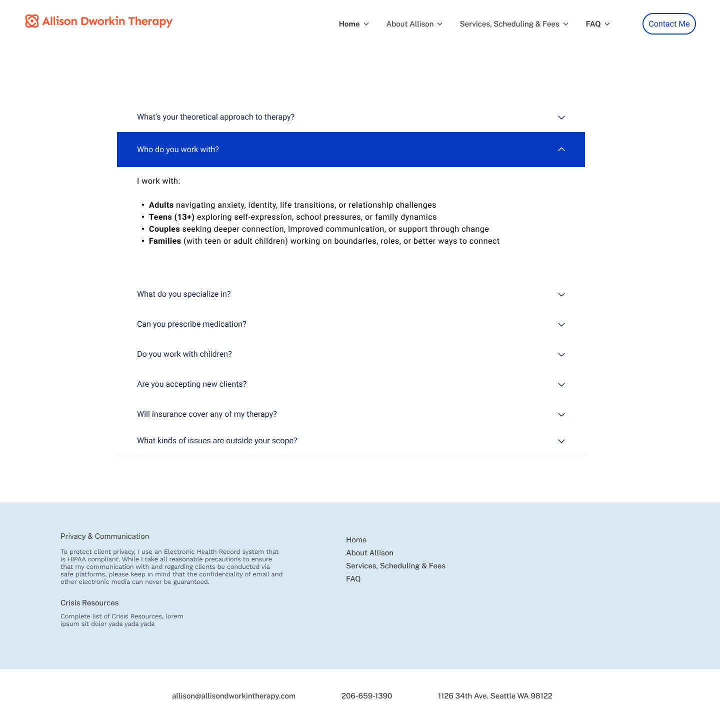
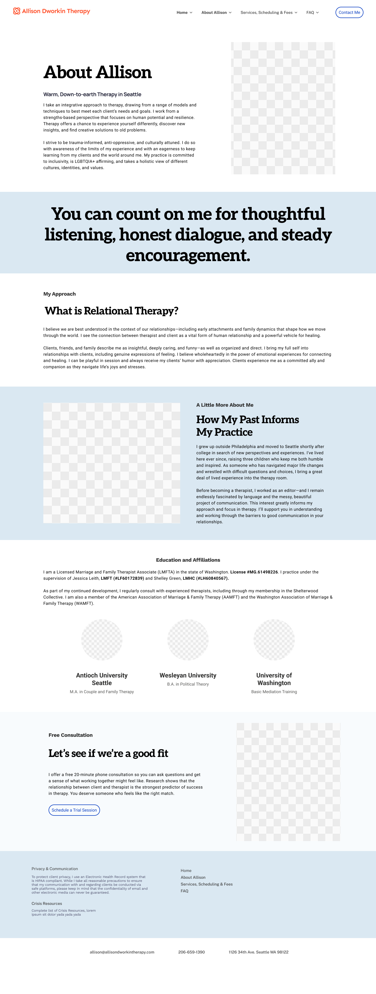
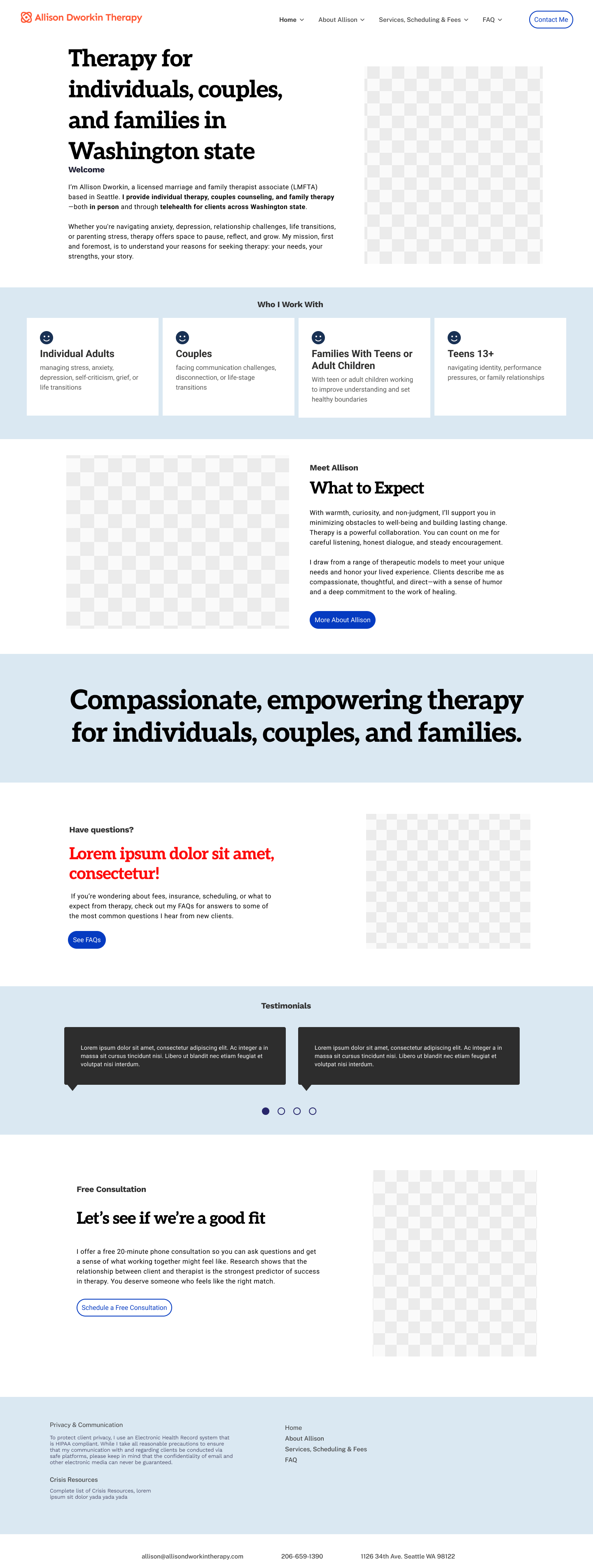
Following the initial brand exploration, it became clear that the client was uncertain about making significant visual changes. In response, we shifted focus to UX and information hierarchy, using high-fidelity wireframes to demonstrate how clarity, pacing, and structure alone could dramatically improve the experience. Dense paragraphs were replaced with concise, scannable content, unnecessary pages were consolidated, and key information surfaced earlier—guiding users from emotional orientation to practical decision-making with less friction.
Click image to enlarge
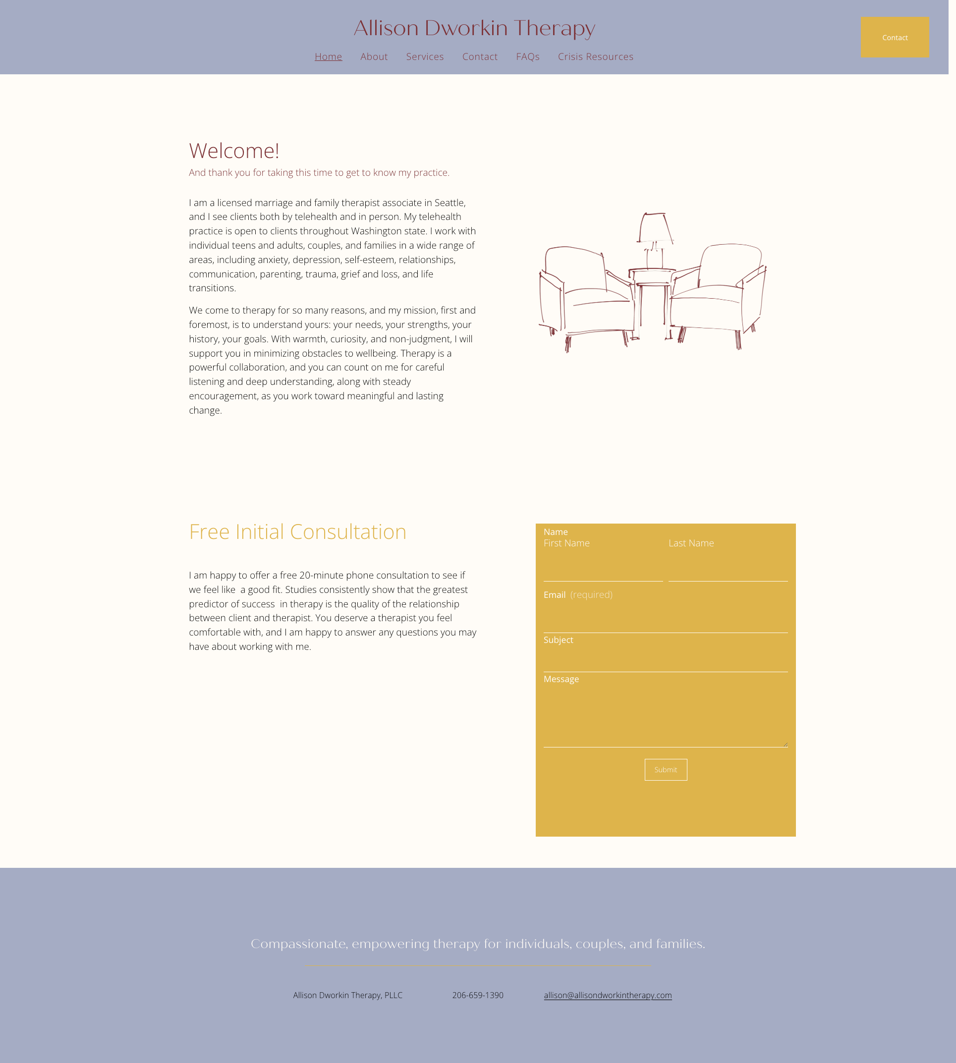
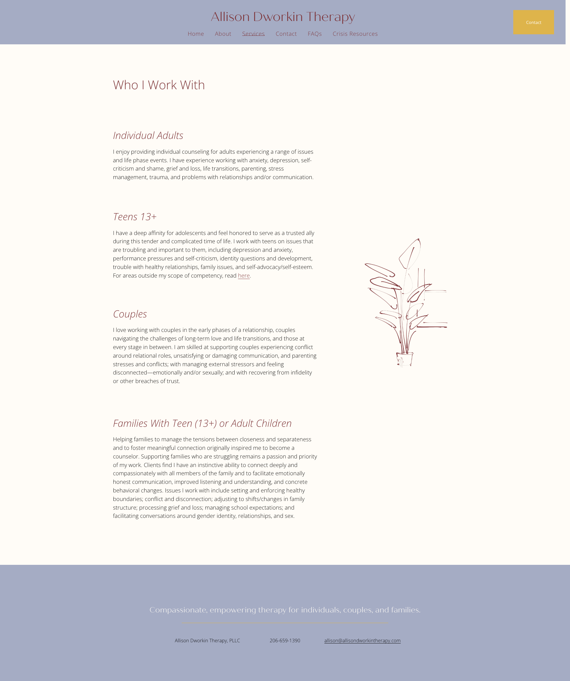
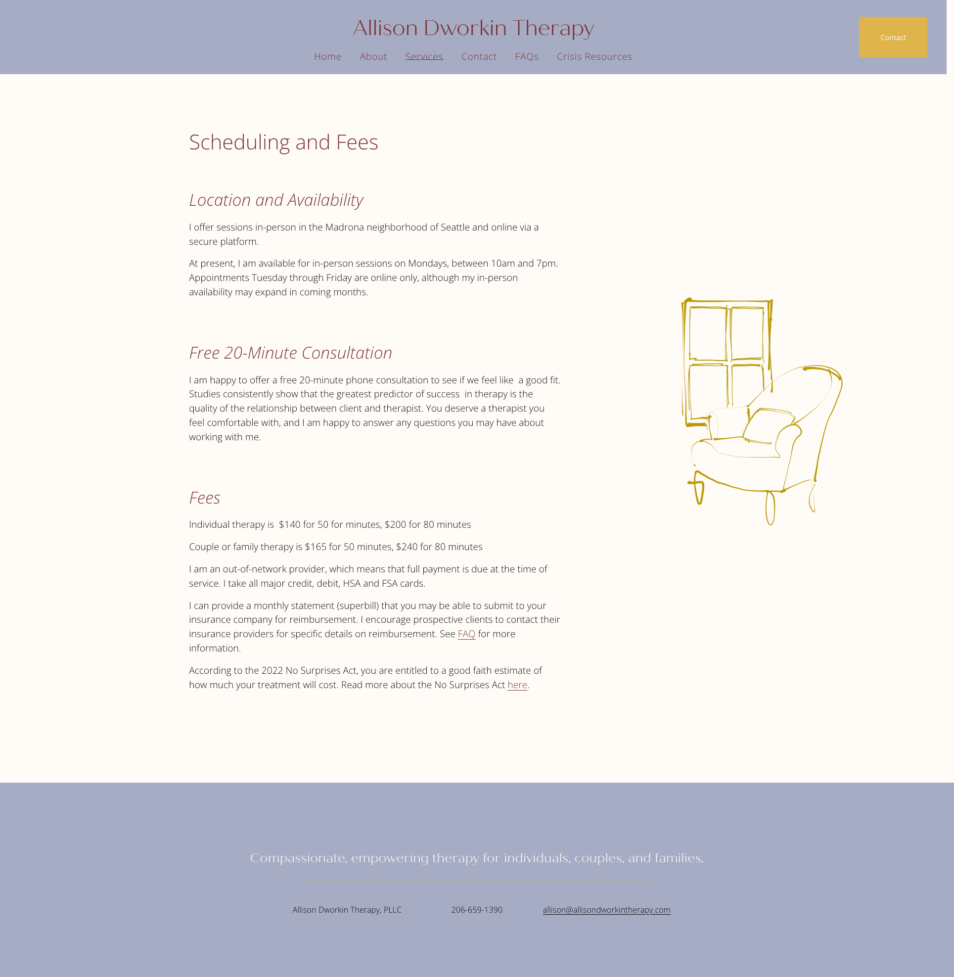
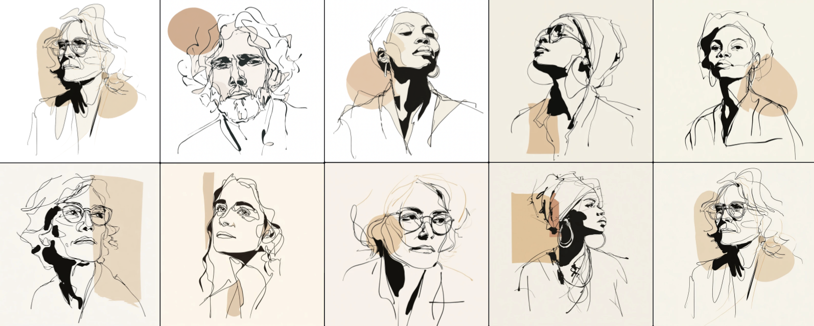
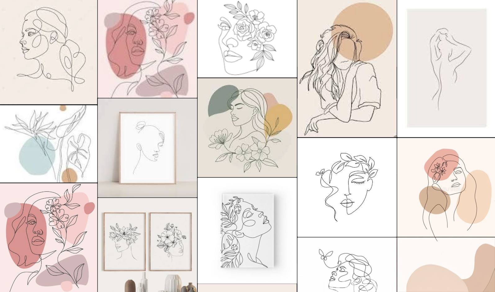
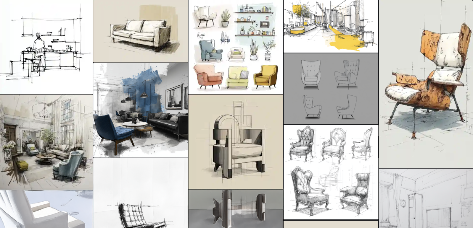
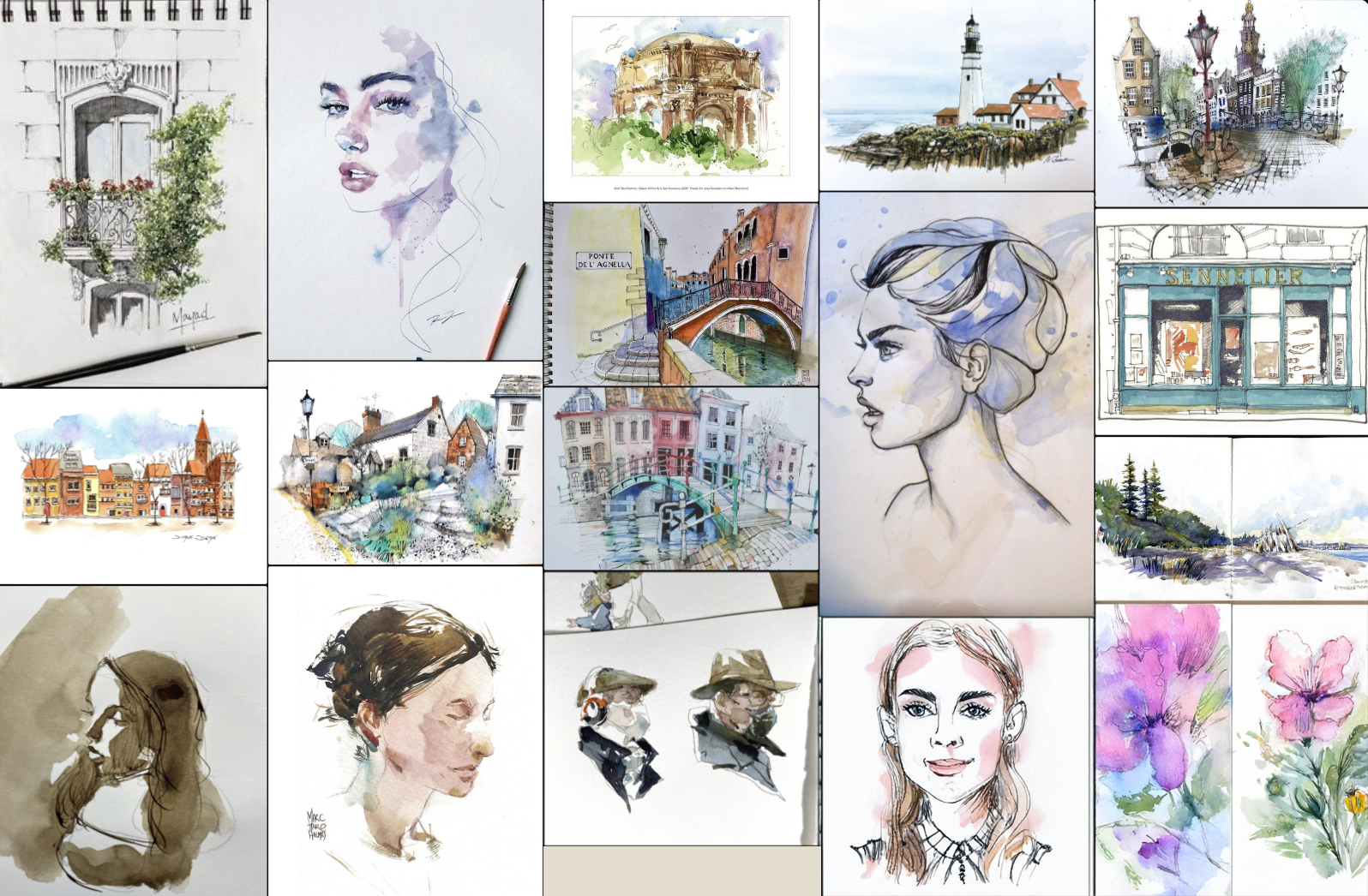
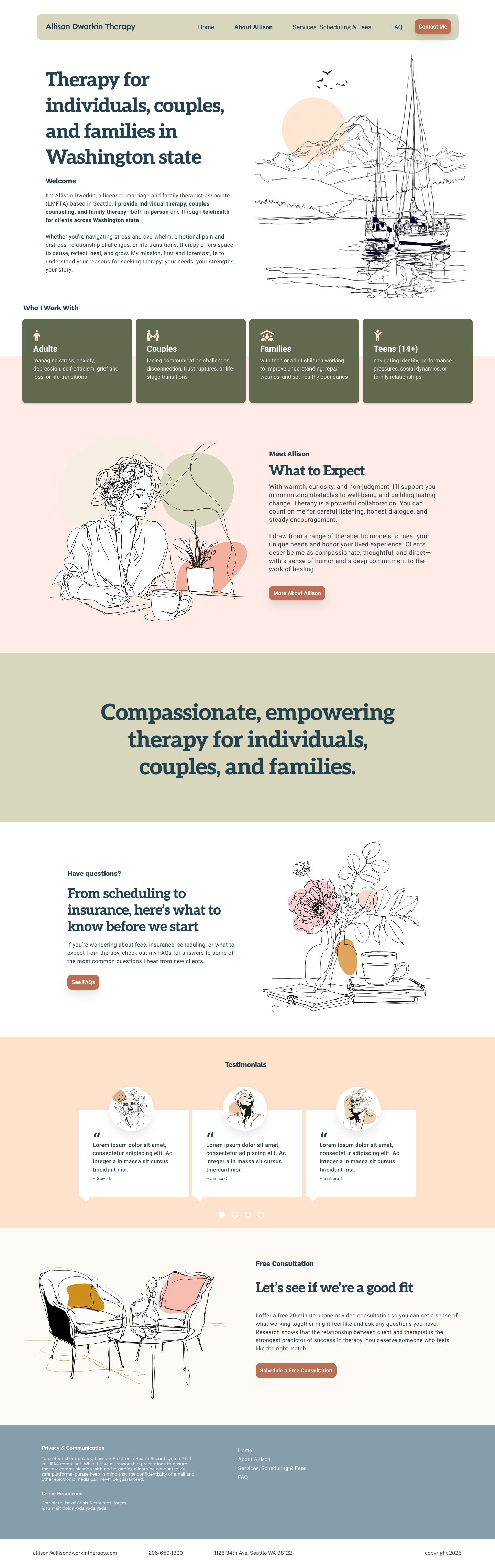
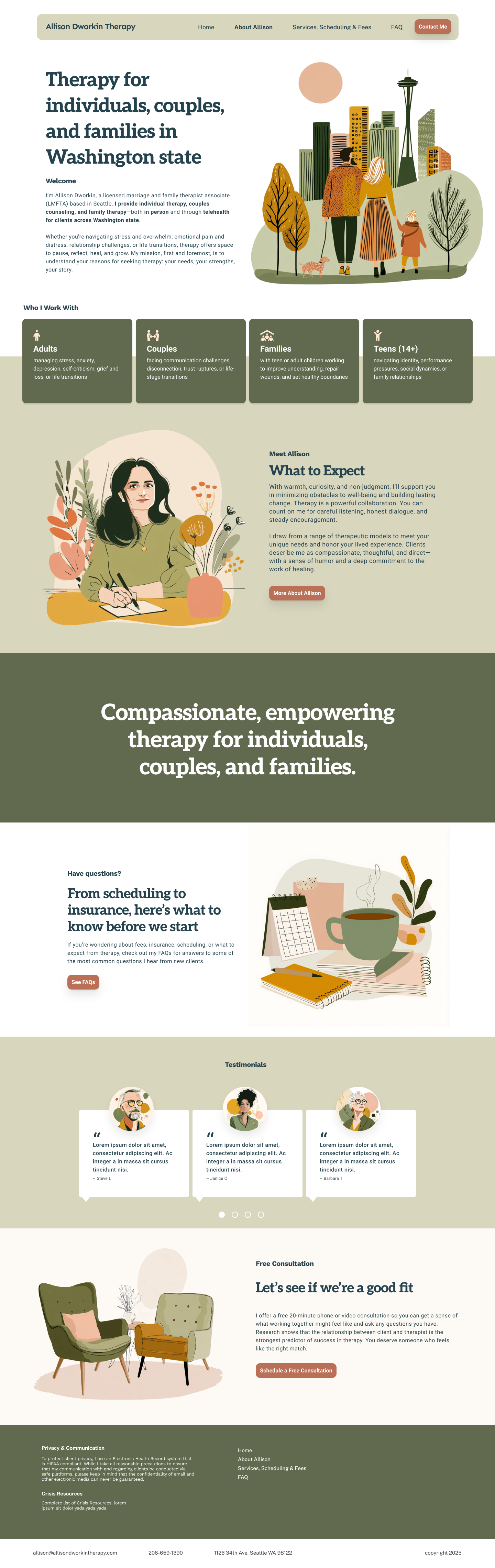
With trust established in the structure, the client expressed a preference for an illustrated approach that felt closer to the warmth and familiarity of her existing site. We aligned on this direction and reintroduced brand exploration through illustration, pressure-testing multiple styles atop the same layout system. AI was used to quickly establish a cohesive visual language—allowing us to maintain momentum while consistently applying the style across both thematic and personal imagery.
Click image to enlarge
With the UX foundation and content structure in place, we applied each illustration style across real site layouts to see how information, color, and imagery worked together as a system. By pairing each visual direction with the same content and hierarchy, we were able to evaluate tone, readability, and emotional resonance in context—revealing how subtle shifts in illustration and color could meaningfully change the feel of the experience without compromising clarity or usability. Which resonates most with you, and why?
Click image to enlarge
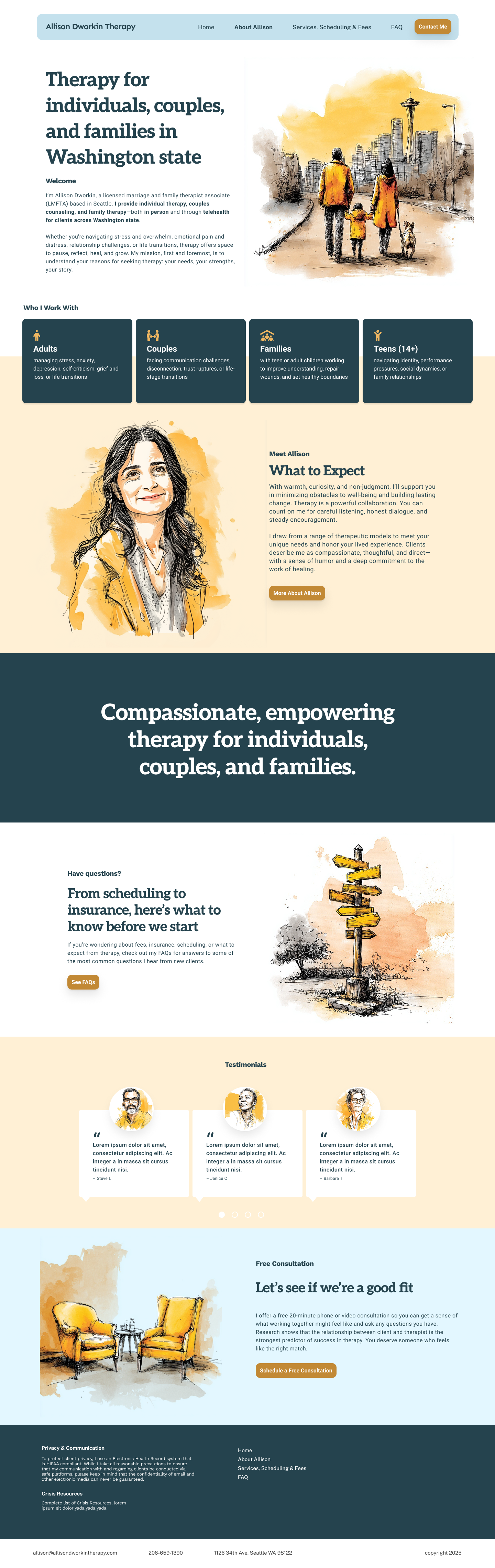
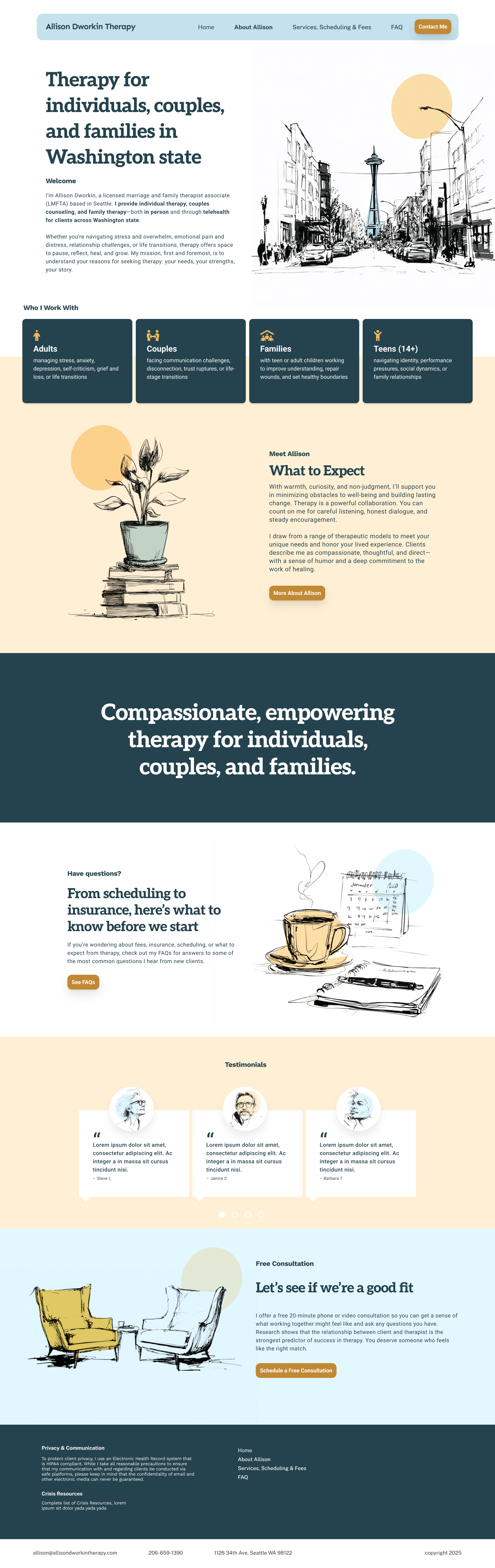
My personal favorite