Helping Give Dimension to a Global Brand—Without the Rulebook
The challenge
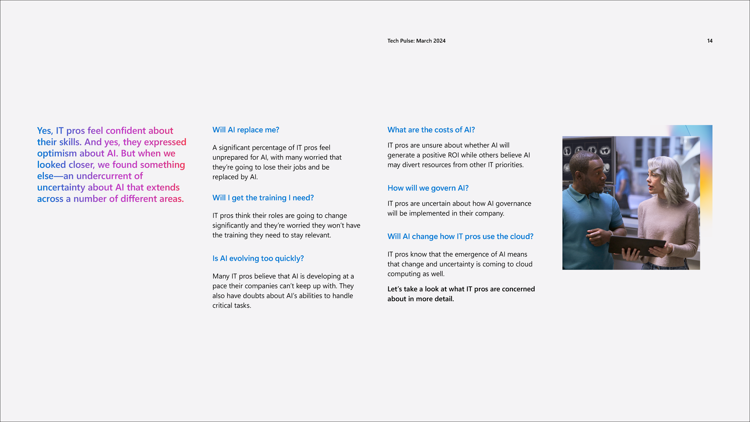
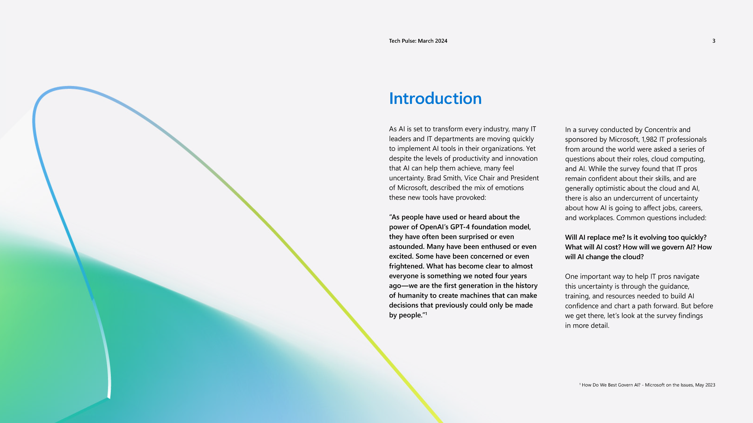
Microsoft’s Tech Pulse report contained meaningful insights about AI adoption, skills gaps, and workforce sentiment—but like many enterprise white papers, it risked being overlooked. The content was dense, data-heavy, and traditionally academic in tone. Compounding the challenge, Microsoft’s brand system was actively evolving, with limited guidance available for vendors on how to interpret or extend the new visual direction.
The brief wasn’t just to design a report—it was to make complex technology insights feel human, relevant, and engaging, while staying credible inside one of the world’s most scrutinized brands.
The insight
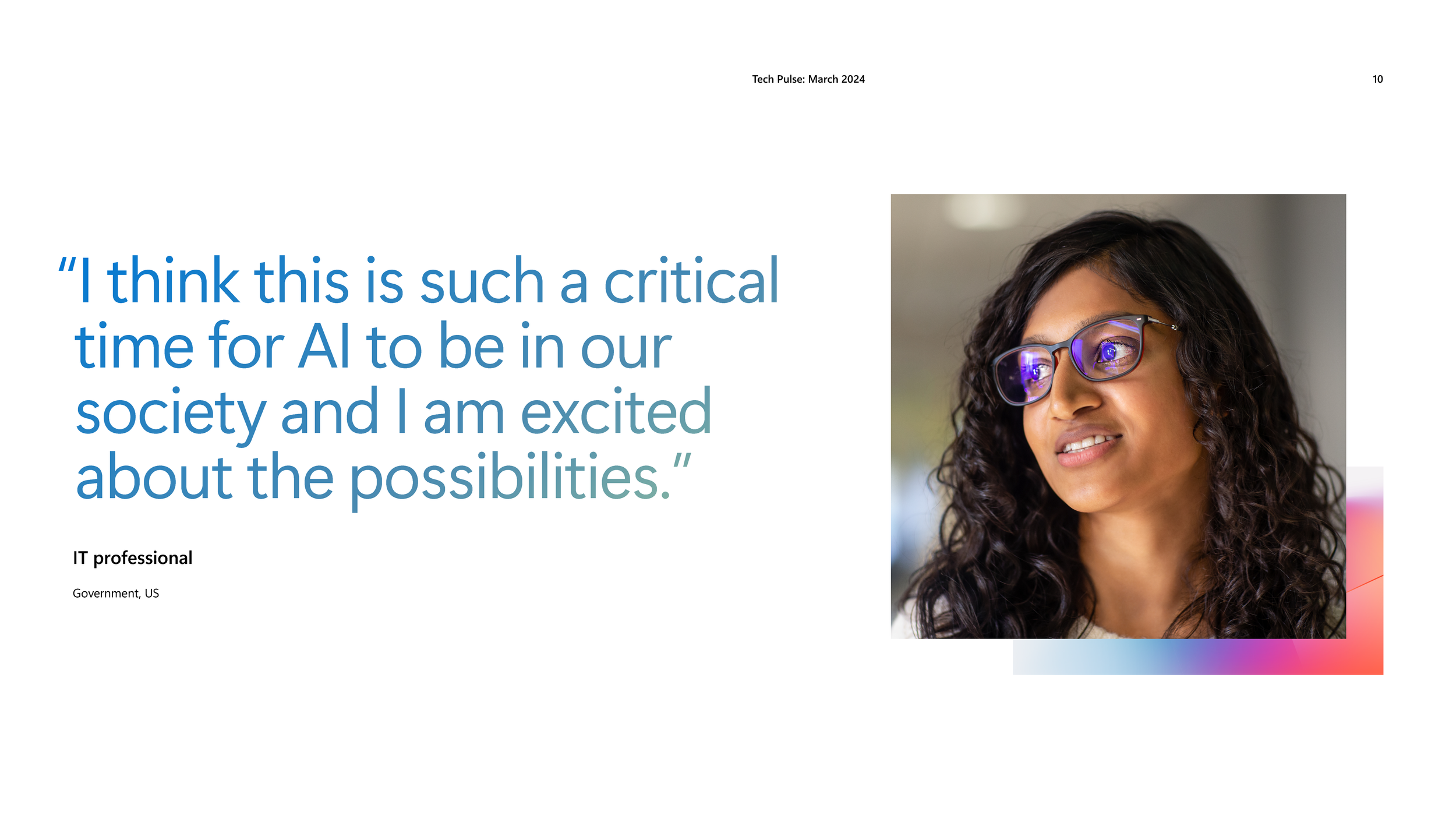
For enterprise audiences, especially around AI, clarity and confidence matter as much as credibility. Readers don’t want to wade through academic abstraction—they want ideas that feel understandable, actionable, and grounded in real-world impact. We also recognized an opportunity: if Microsoft was still defining its visual language, this project could help shape it—using storytelling, illustration, and dimensional design to bring warmth and momentum to a traditionally static format.
The solution
With limited brand documentation available, we leaned into first principles. Using the core tenets of the evolving Microsoft brand as a foundation, we developed a distinct visual system that balanced authority with approachability.
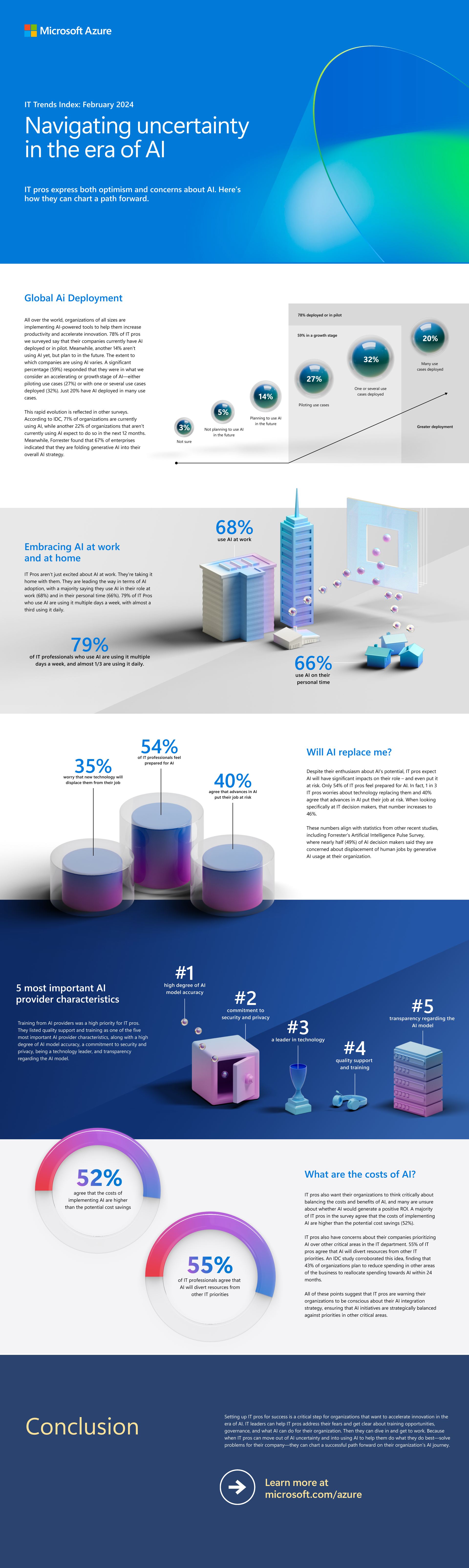
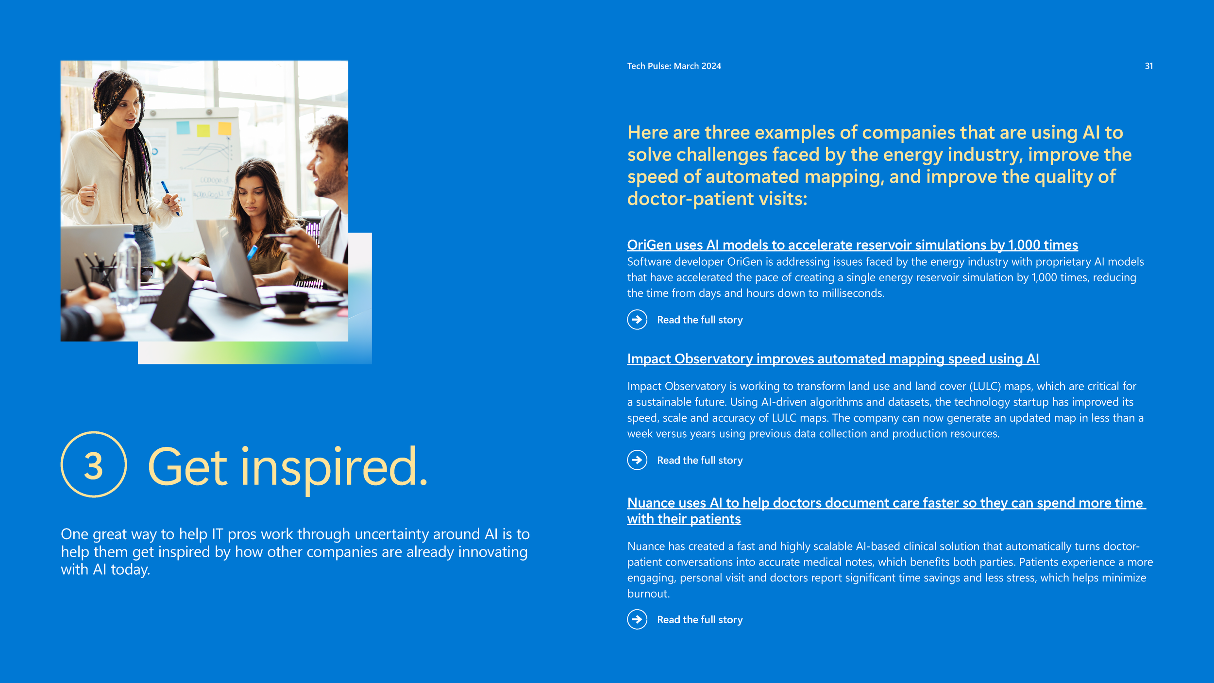
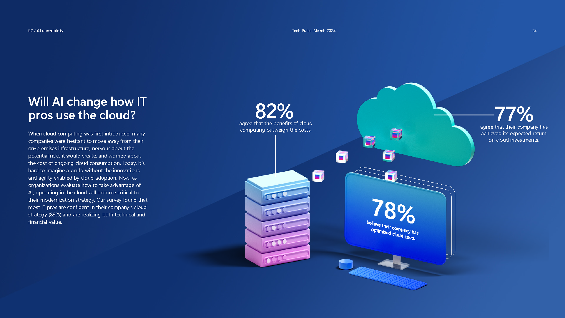
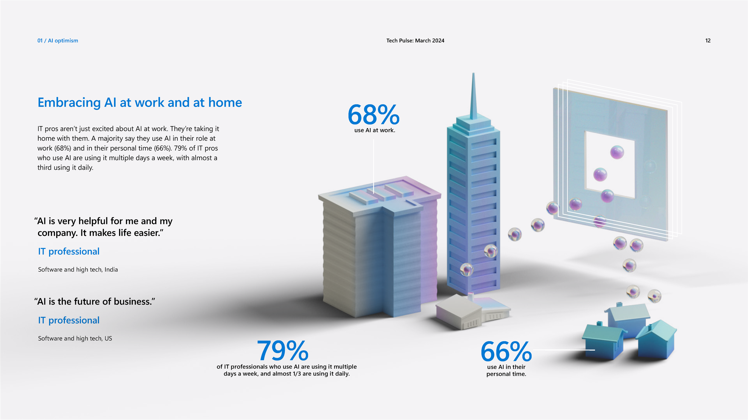
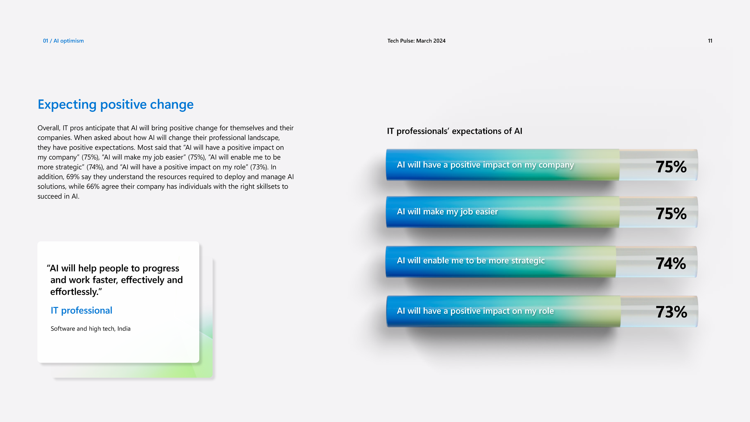
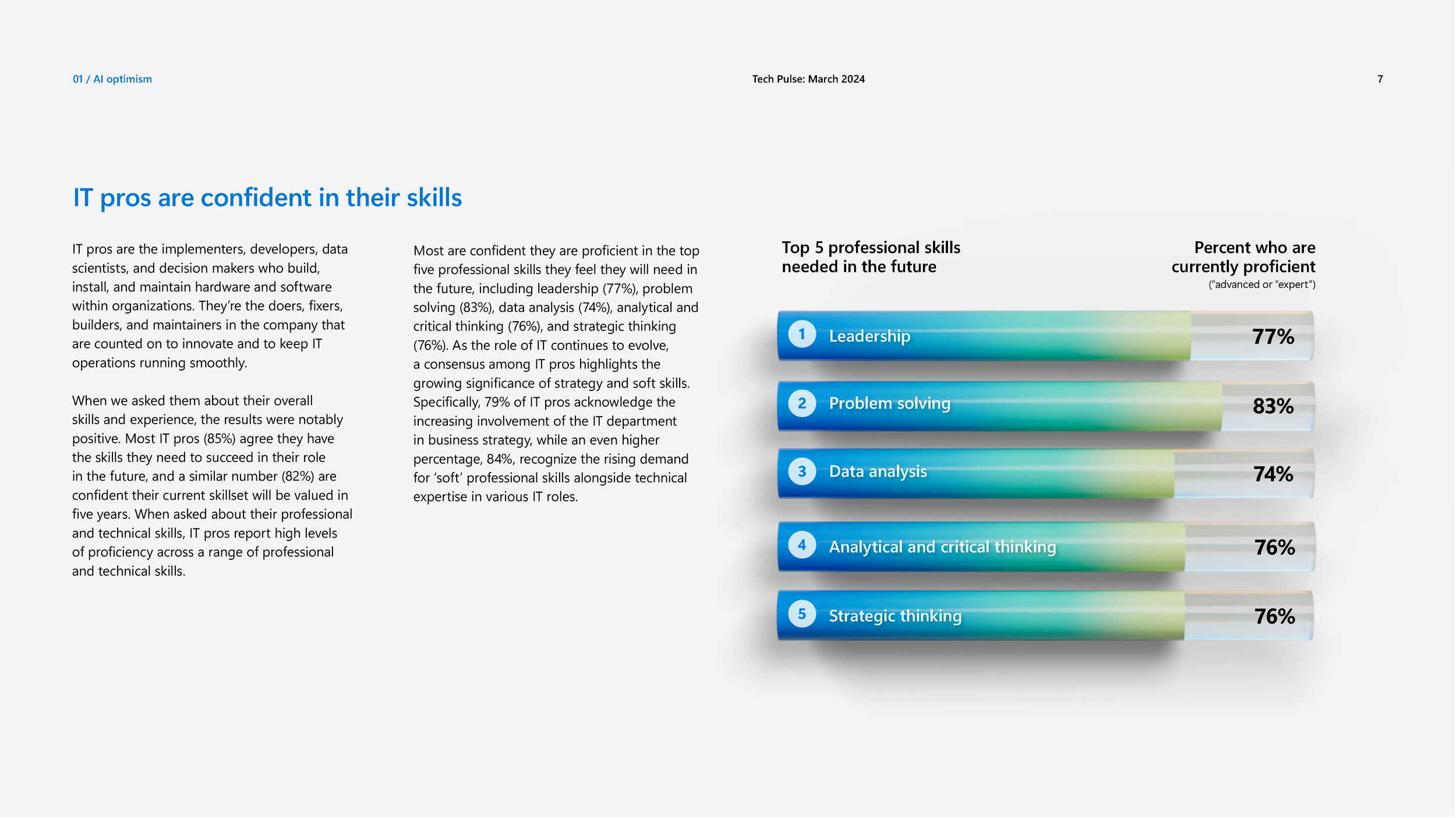
Flat illustration and soft, geometric 3D elements were used to translate abstract concepts—trust, scale, preparedness, risk—into visual metaphors that felt intuitive and modern. Color gradients and lighting introduced warmth and motion, reinforcing optimism without sacrificing seriousness.
Click image to enlarge


Data visualization became a key storytelling tool rather than an afterthought. Instead of default charts, we designed dimensional, object-based graphs that aligned with the 3D visual language—turning statistics into spatial narratives that were easier to read, more memorable, and visually compelling.
Click image to enlarge
To see the whole report go here
The result was a cohesive, future-forward experience that elevated the content, pushed Microsoft’s evolving aesthetic forward, and demonstrated how thoughtful design can make even the most complex topics feel accessible.
The work was later praised by Microsoft’s Executive Creative Director, who noted that the team’s interpretation helped clarify where the brand could go—and expressed a desire for more partners who could turn limited guidance into strong, self-directed creative outcomes.
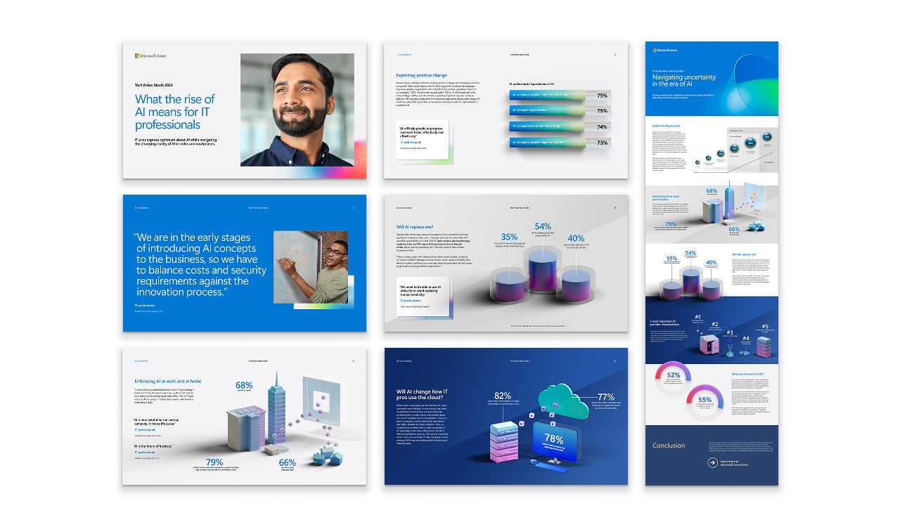
In addition to the white paper we also created a more scannable infographic that could be broken up in to snackables for social: