Reimagining a Self-Guided Relocation Experience
The challenge
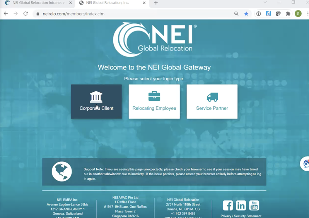
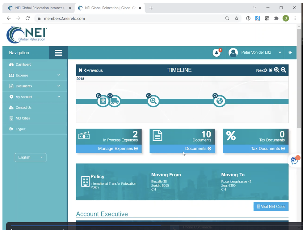
The pre-existing portal was built for functionality, not experience. Dense layouts, monochromatic visuals, limited accessibility considerations, and fragmented navigation placed a heavy cognitive burden on users—many of whom were interacting with NEI for the first time, under stress, and without prior context.
From a UX standpoint, users were expected to intuit workflows, interpret policy details, and manage complex tasks without guidance. From a design standpoint, the visual system reinforced confusion rather than alleviating it, offering little hierarchy, warmth, or reassurance. The result was a transactional experience misaligned with the human reality of relocation.
The NEI relocation portal BEFORE our redesign
The insight
Relocation is a journey, not a task. Most users don’t arrive by choice, which means trust, clarity, and reassurance must be established immediately. Effective self-service isn’t about exposing more features—it’s about guiding users through what matters now, using both UX and visual design to reduce cognitive and emotional load.
The solution
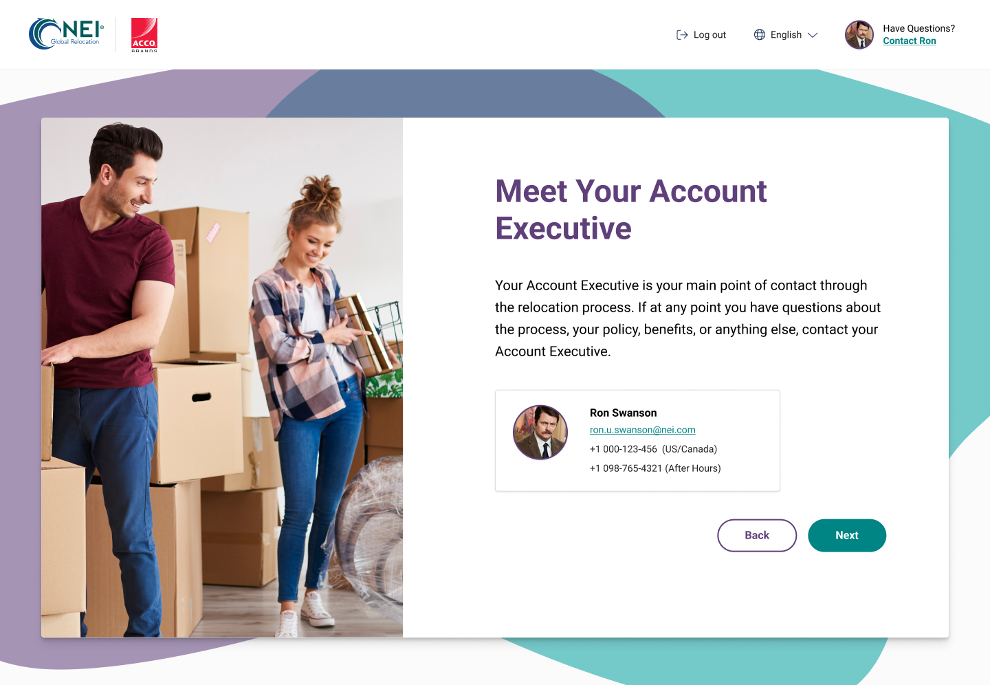
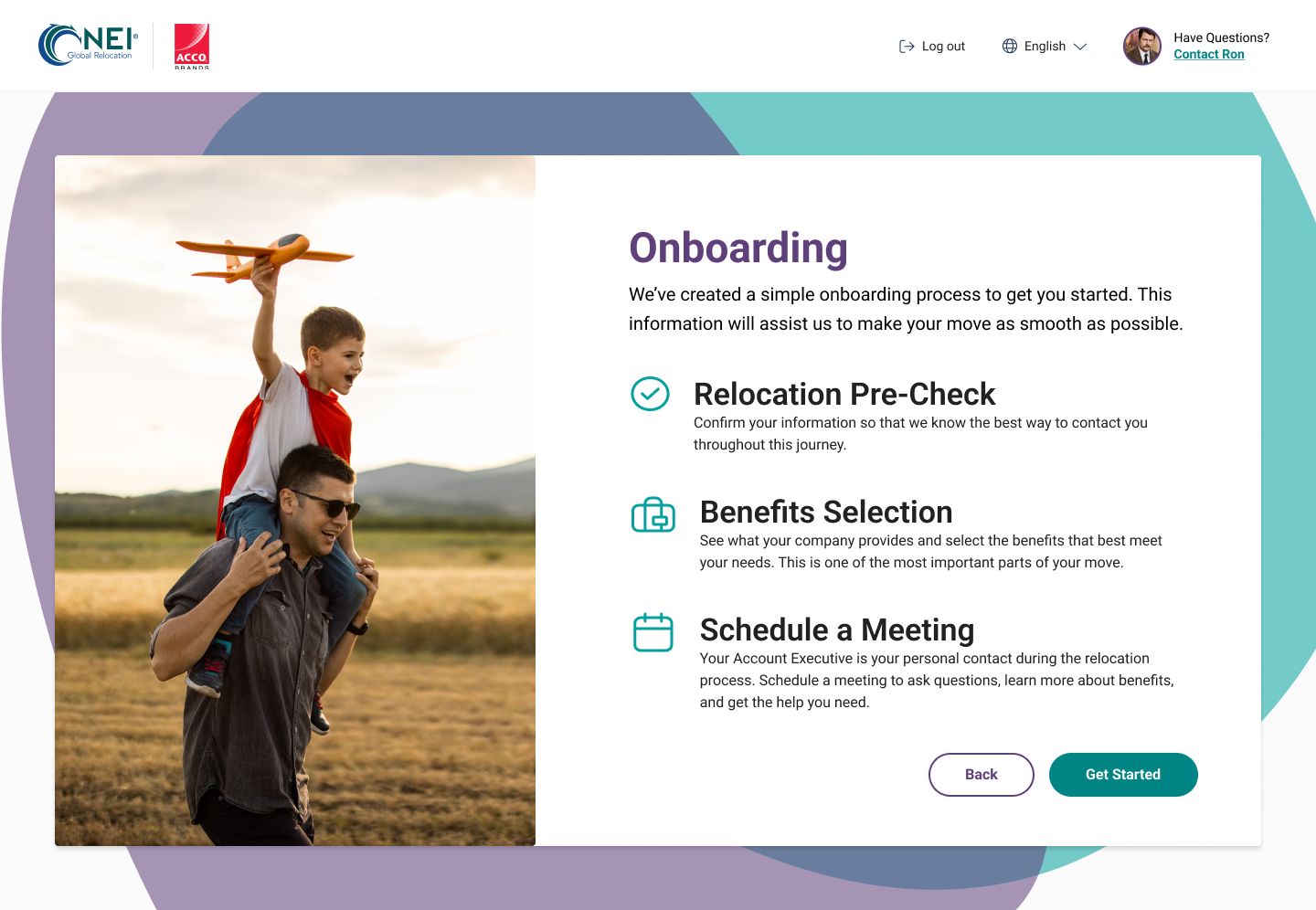
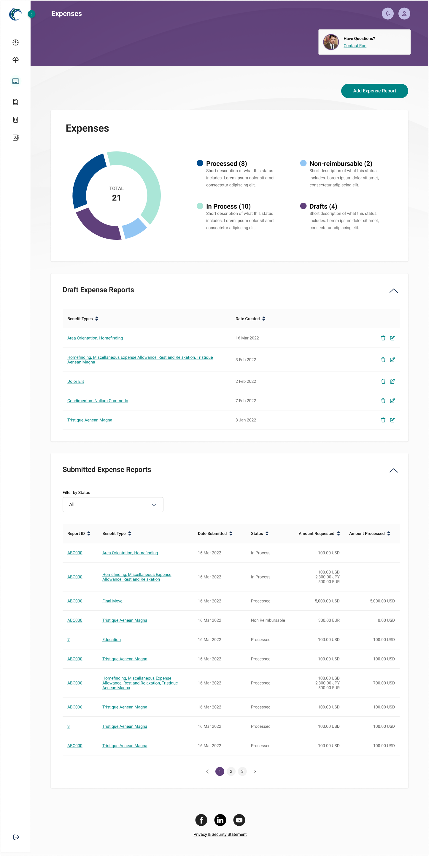
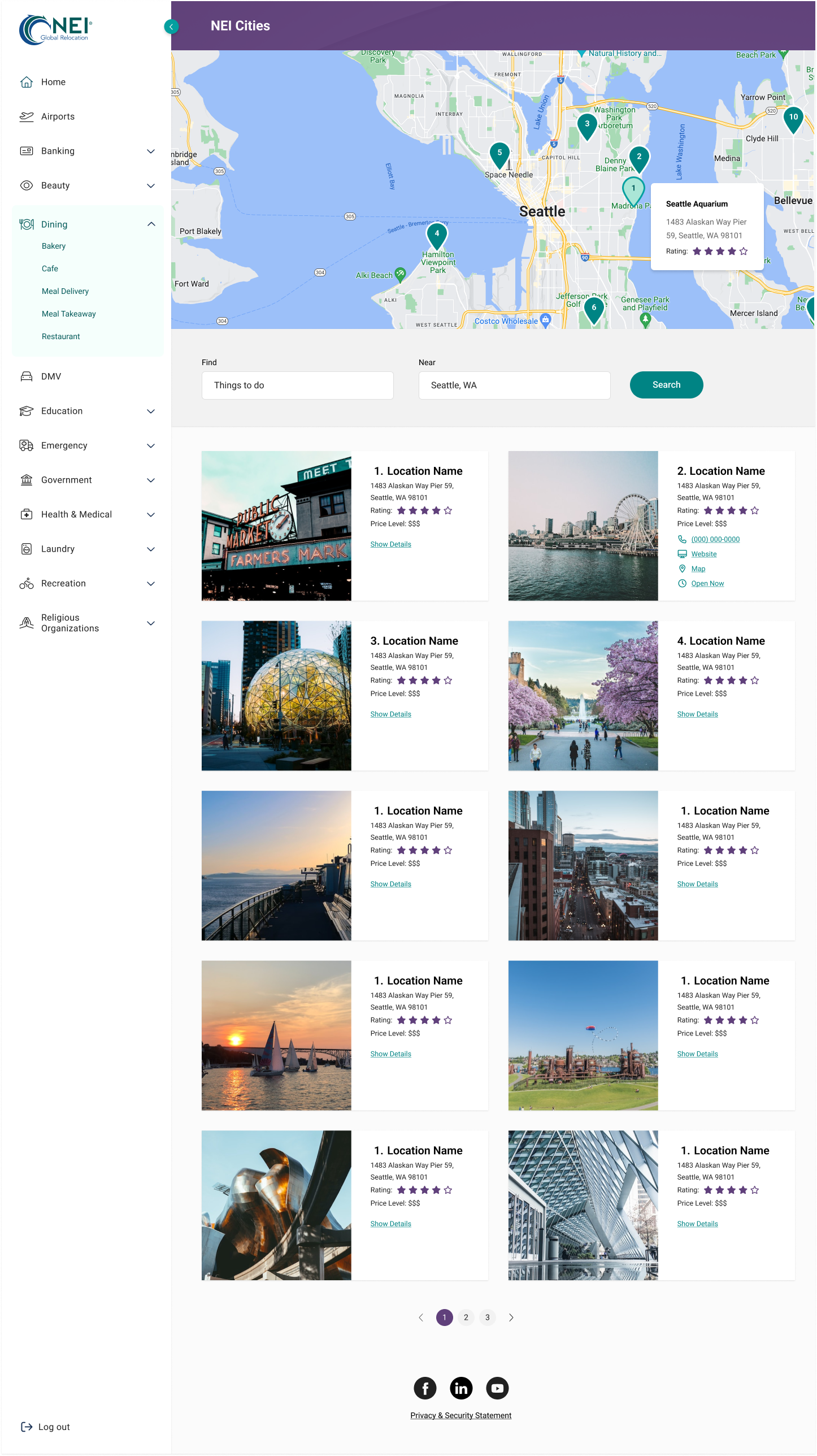
We redesigned the portal as a guided, human-centered experience where design and UX work together to turn complexity into confidence. Context-aware onboarding welcomes new users, while an action-first dashboard prioritizes next steps for returning ones. Accessible visual systems, clear hierarchy, progressive disclosure, and simplified workflows across benefits, expenses, documents, and resources empower users to self-manage their relocation while reinforcing NEI as a trusted partner throughout the journey.
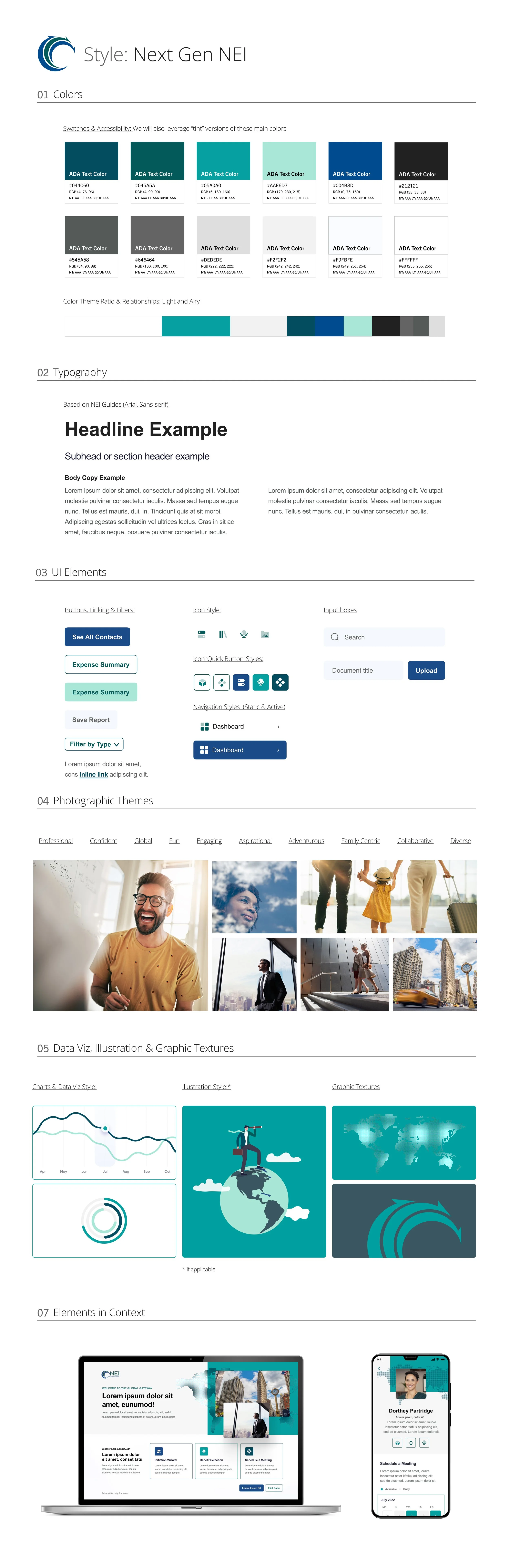
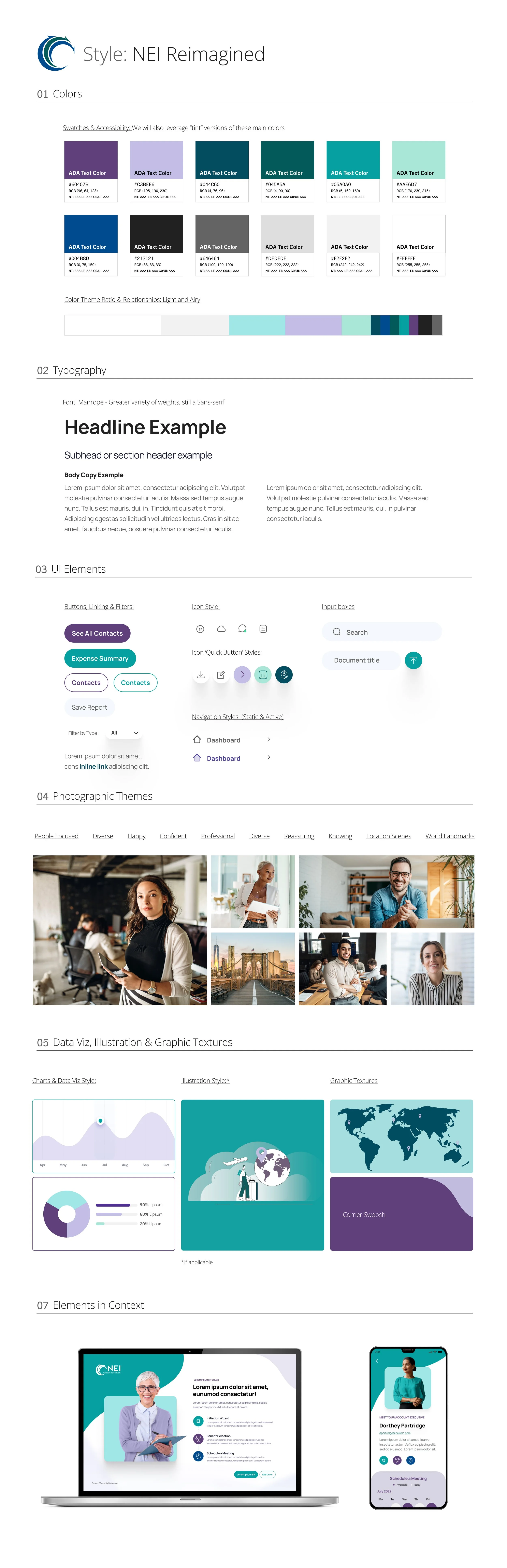
Deep Dive–Style Tiles
We proposed a shift away from the portal’s flat, monochromatic aesthetic toward a warmer, more accessible visual system that introduces hierarchy, contrast, and human presence. These style directions explore how color, typography, and imagery could balance enterprise credibility with empathy—reducing cognitive load while visually positioning NEI as a trusted guide, not just an administrative platform, during complex relocation journeys.
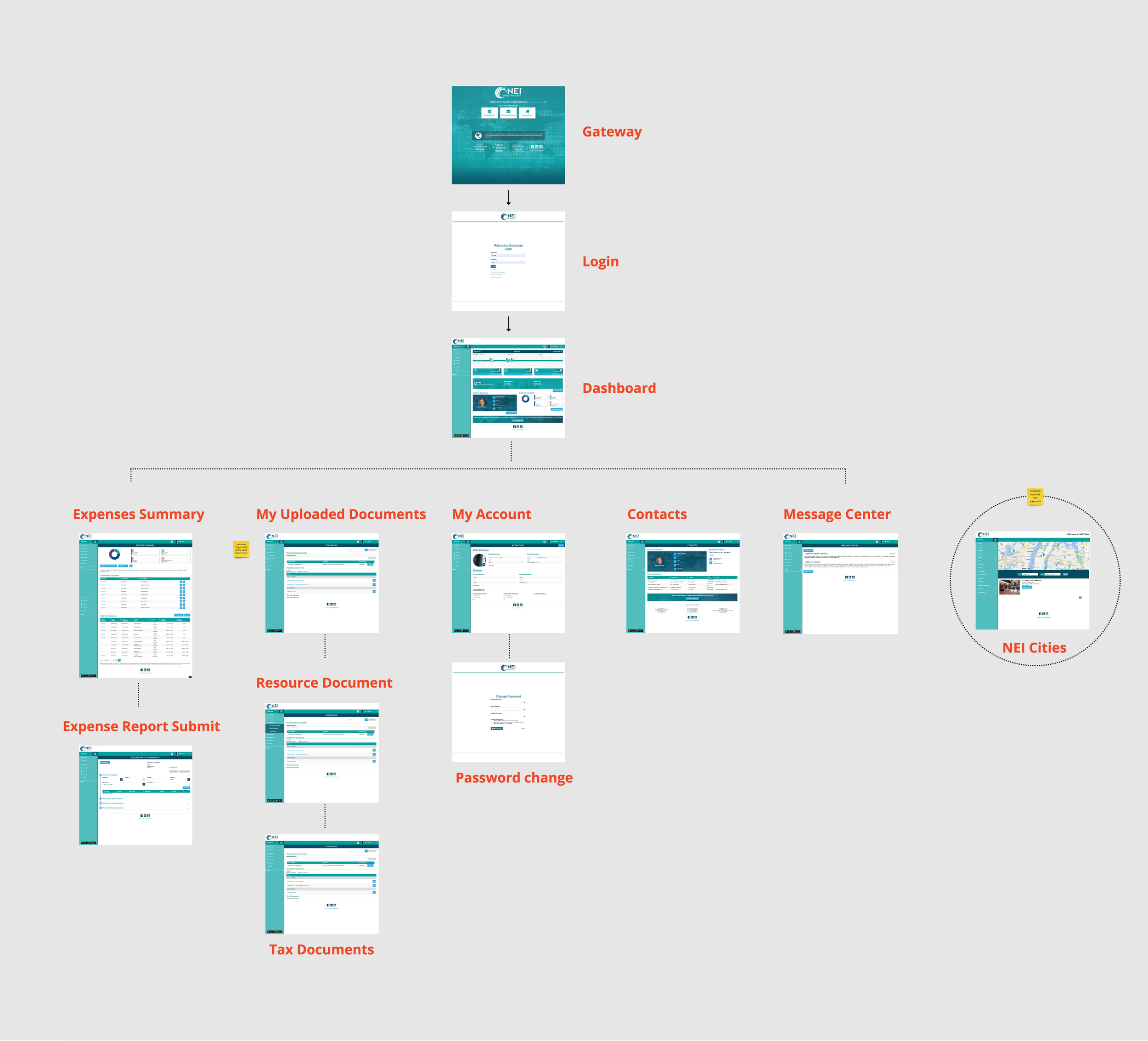
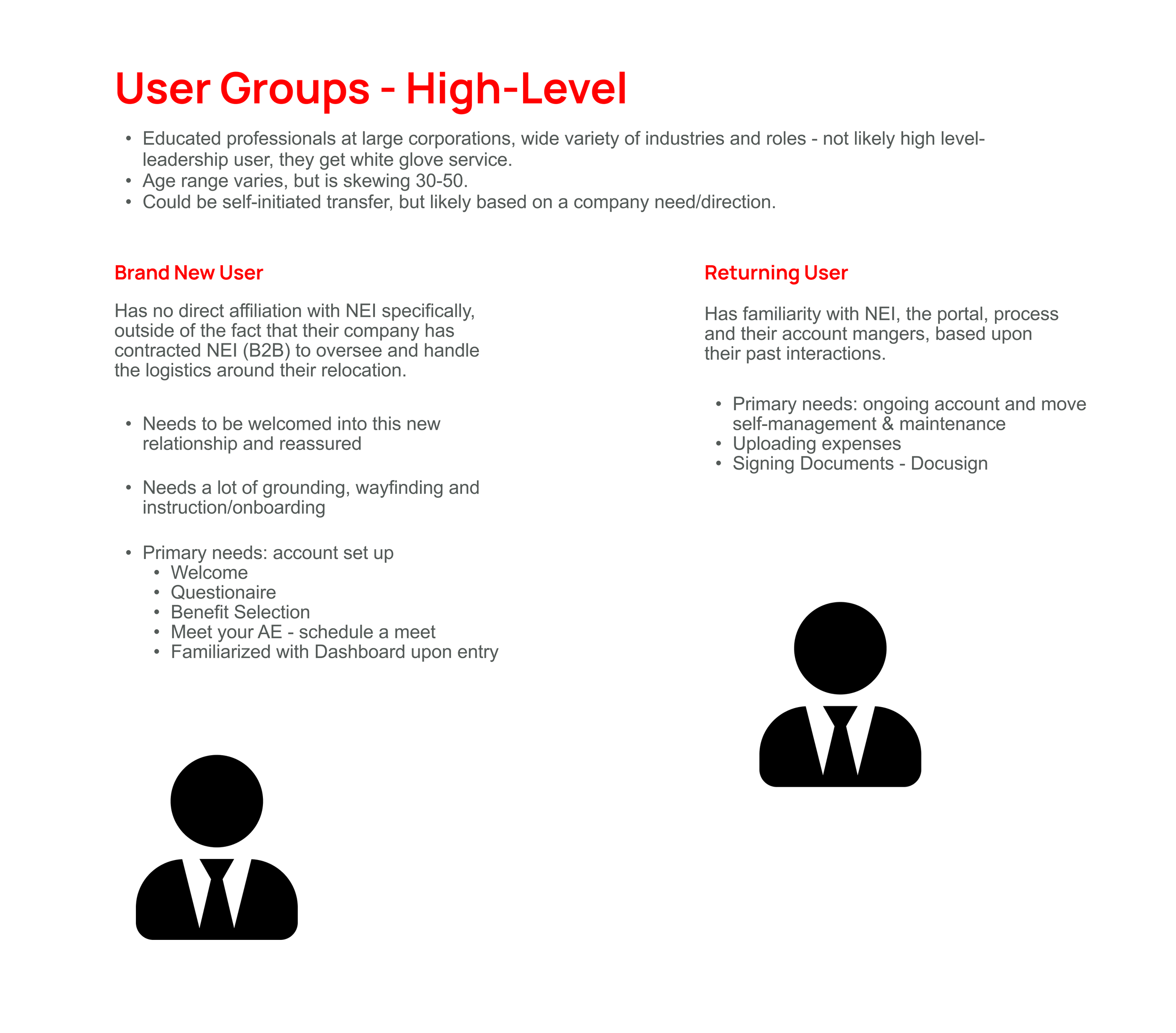
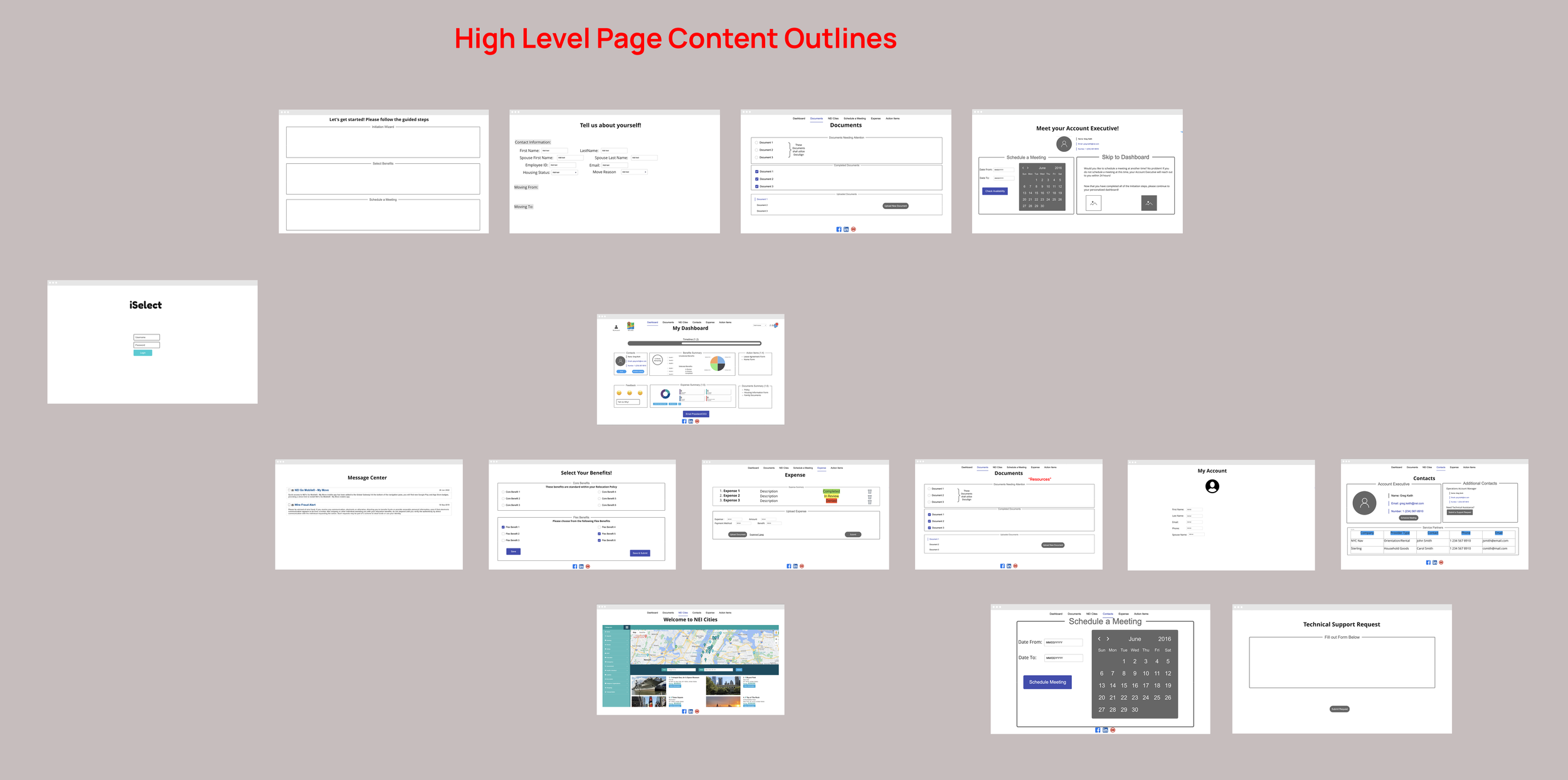
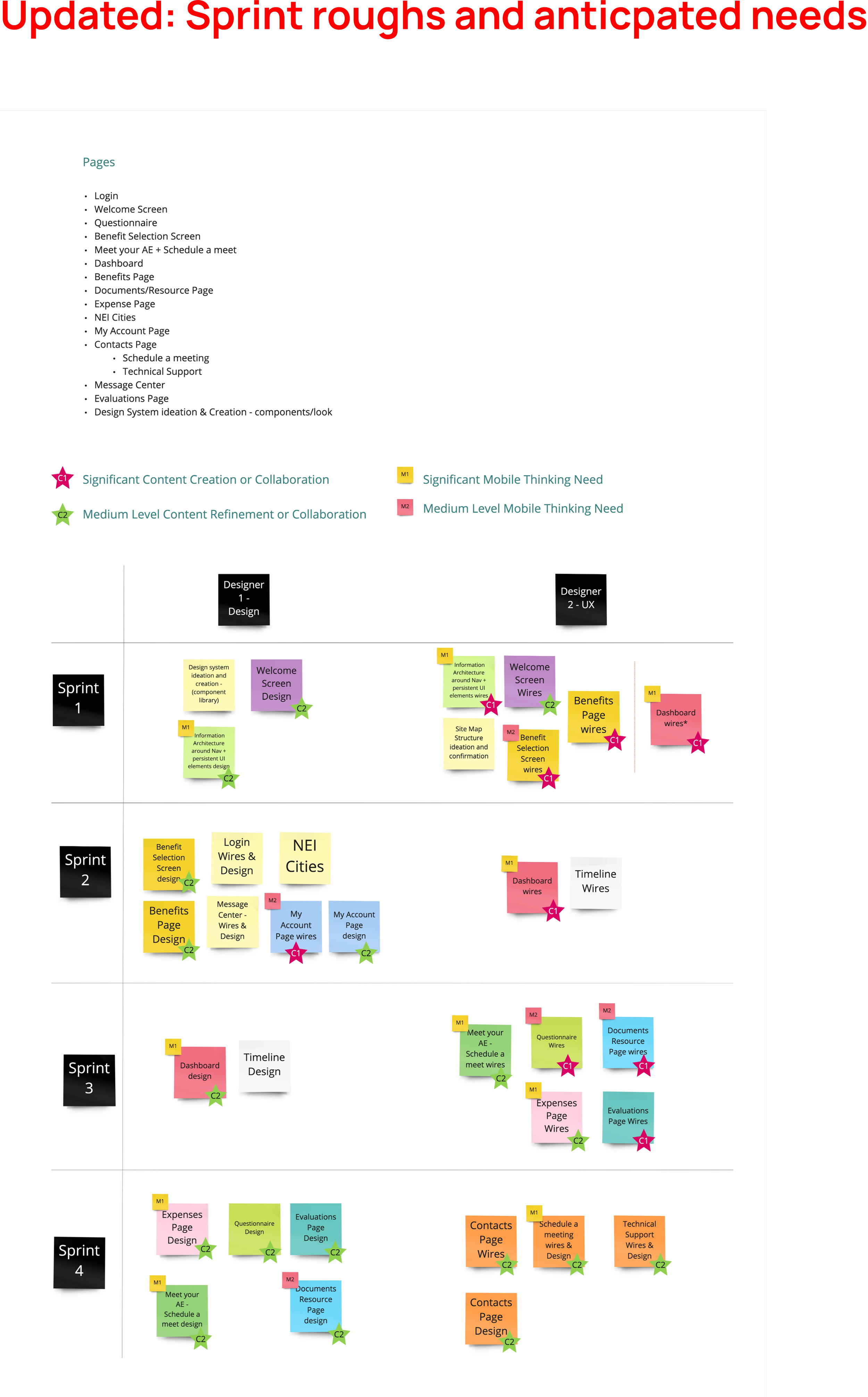
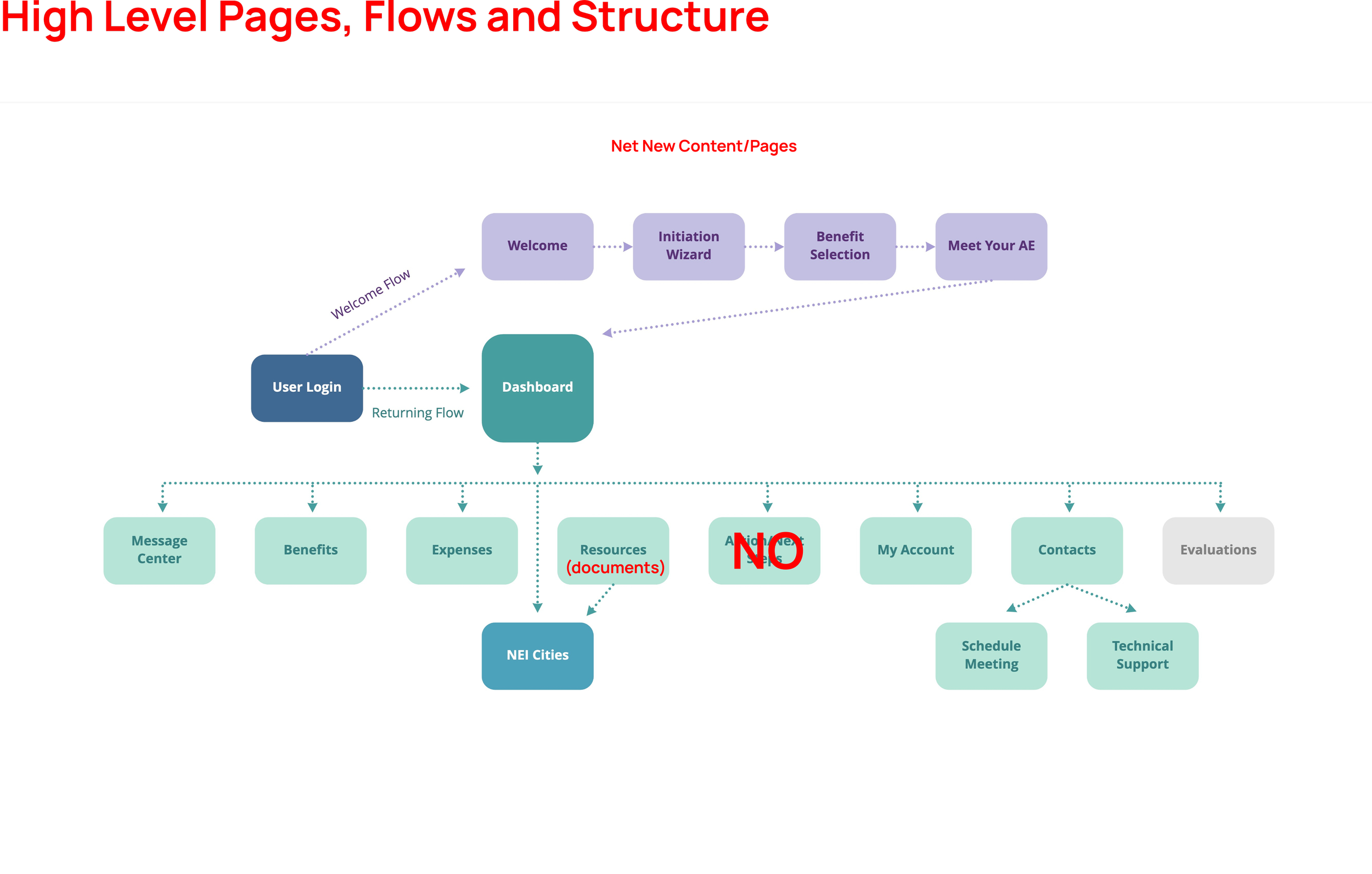
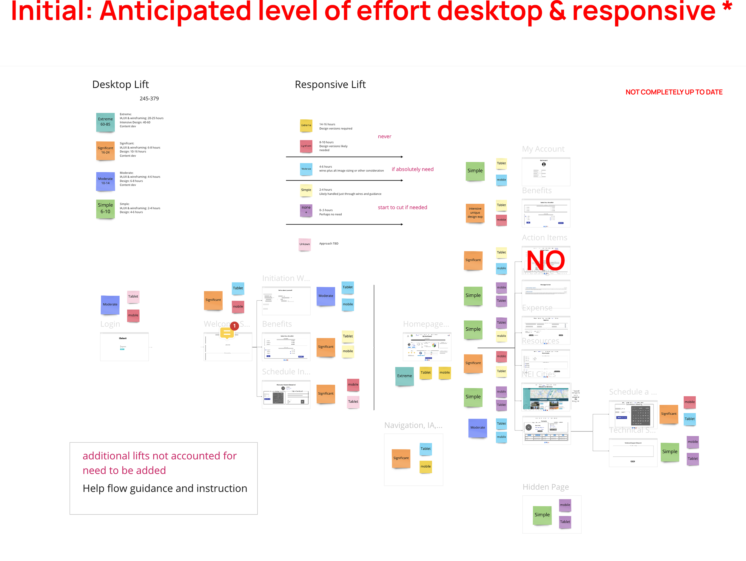
Deep Dive: UX, Requirements & Flow
We proposed restructuring the portal around a guided, task-oriented experience that adapts to user context rather than exposing all complexity at once. Directionally, this included a clearer onboarding flow for new transferees, an action-first dashboard for returning users, and simplified core workflows using stronger hierarchy and progressive disclosure—enabling a more confident, self-guided relocation experience with reduced friction and reliance on support.
Click image to enlarge
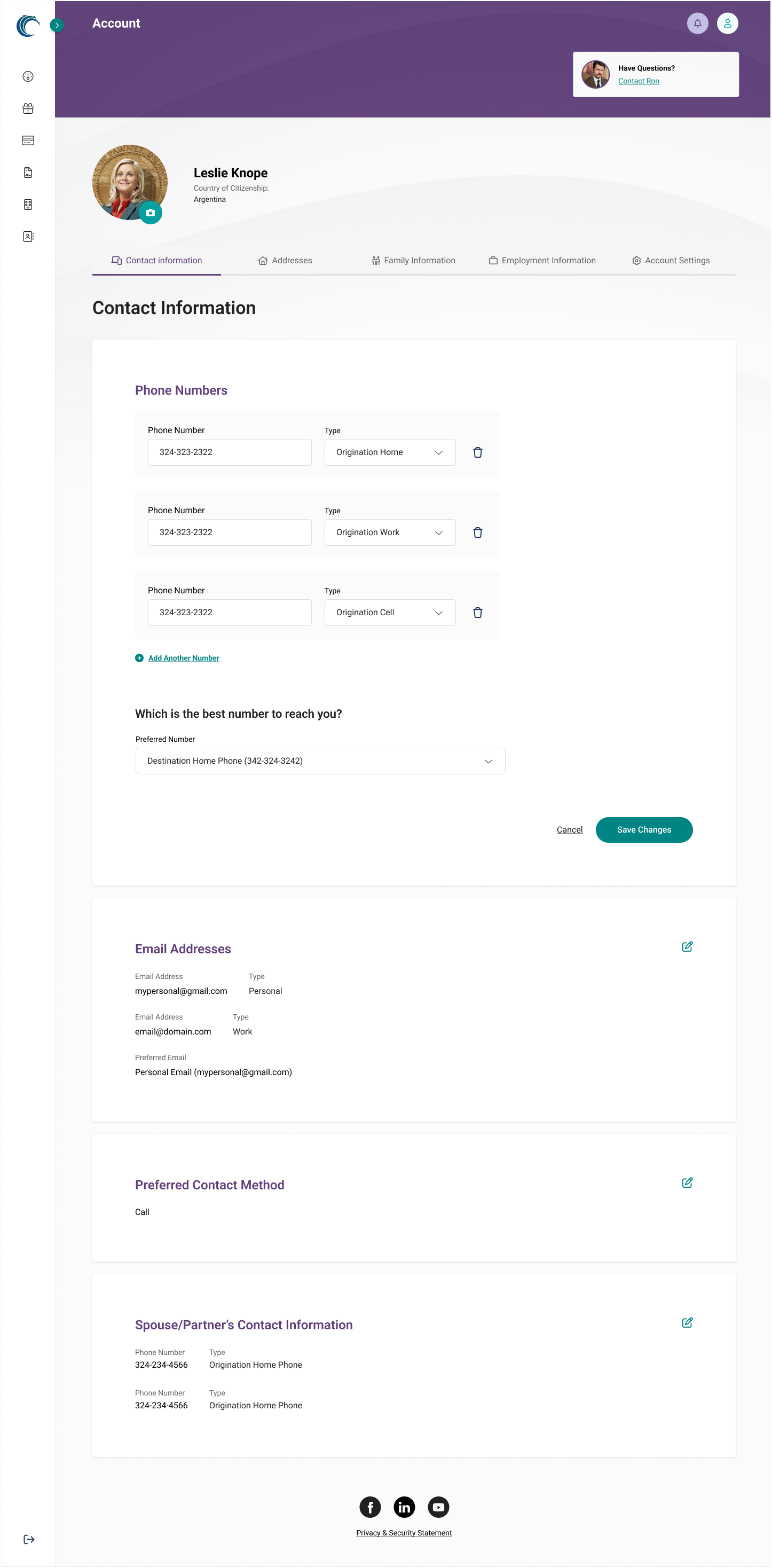
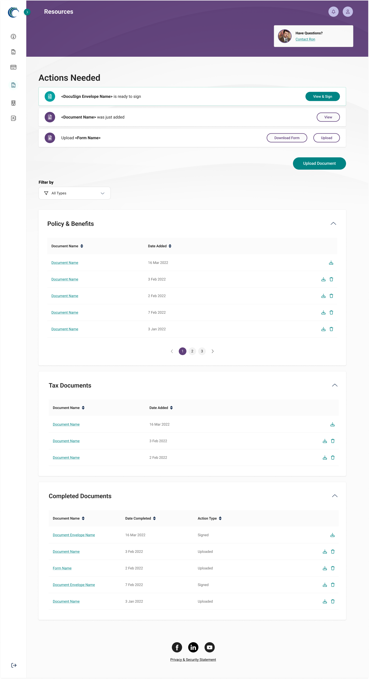
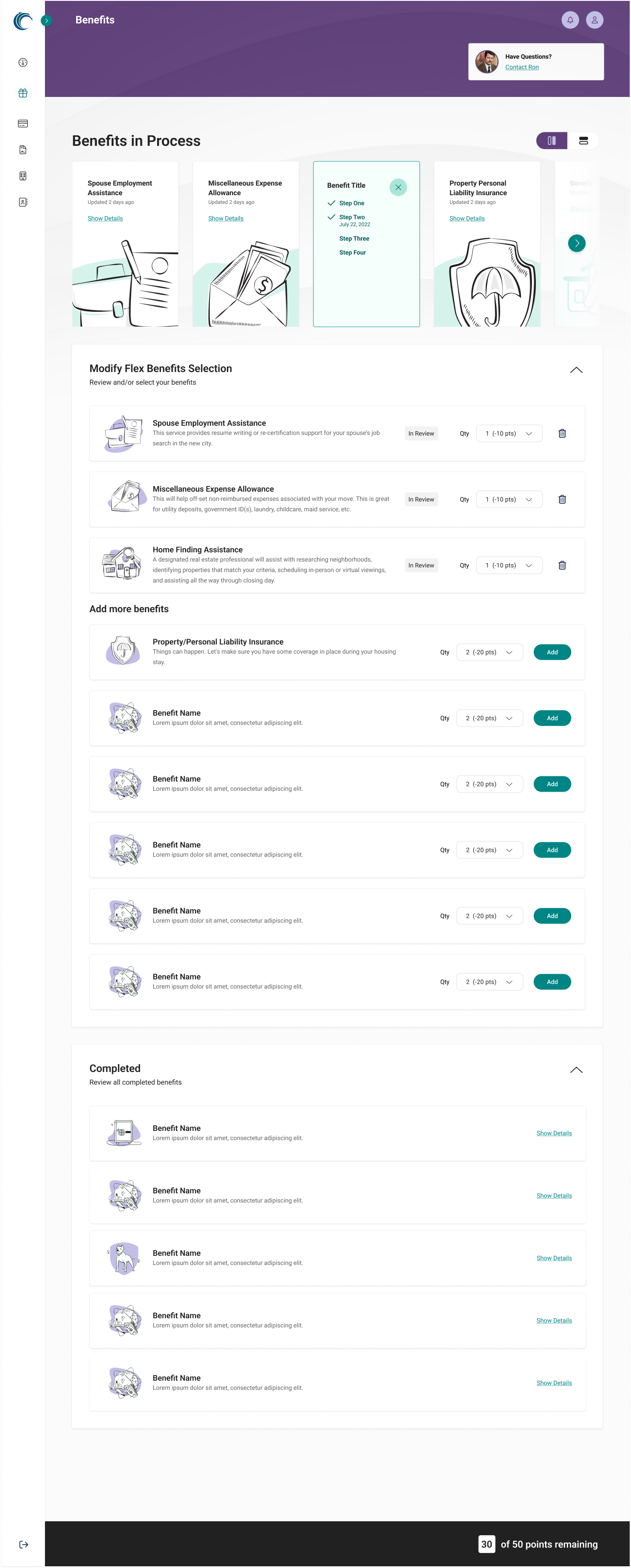
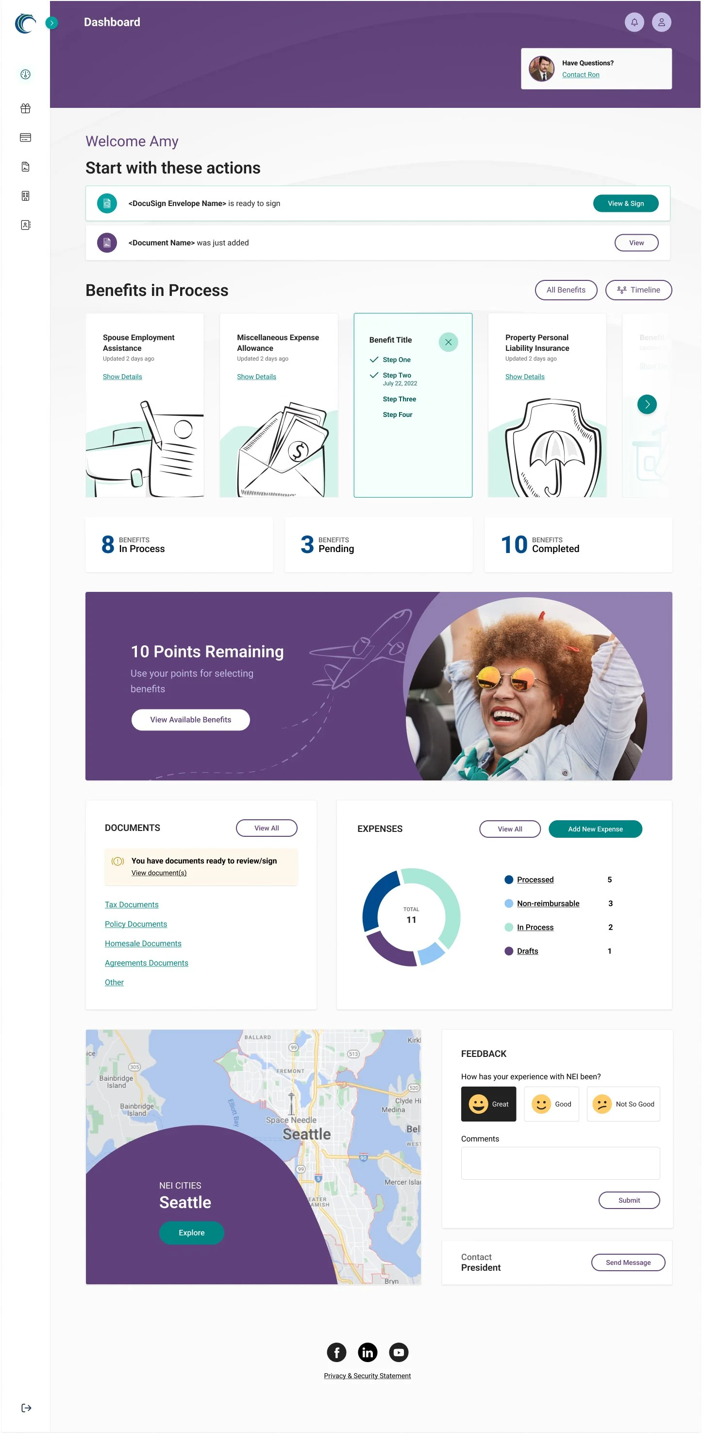
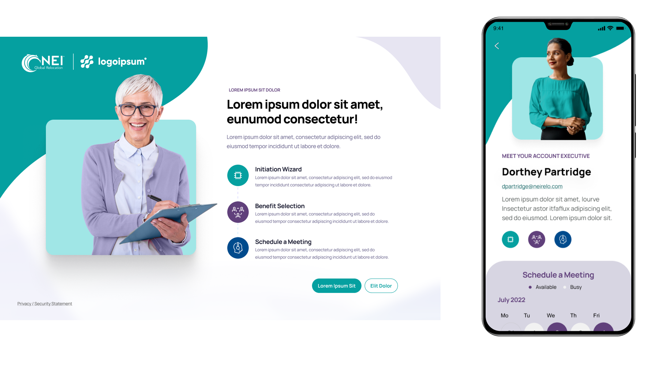
Deep Dive: the end product
Together, the final design and UX bring the proposed direction to life as a cohesive, human-centered relocation platform. The experience pairs a warm, accessible visual system with guided, task-focused flows that clarify what matters, when it matters. The result is a self-guided portal that feels calm, intuitive, and supportive—transforming a previously system-driven interface into an experience that builds confidence, reduces friction, and reinforces NEI’s role as a trusted partner throughout the relocation journey.
Click image to enlarge